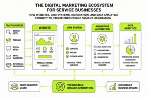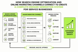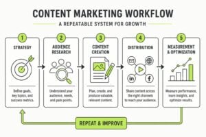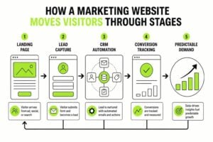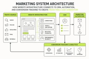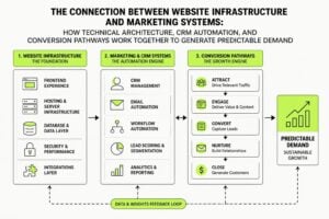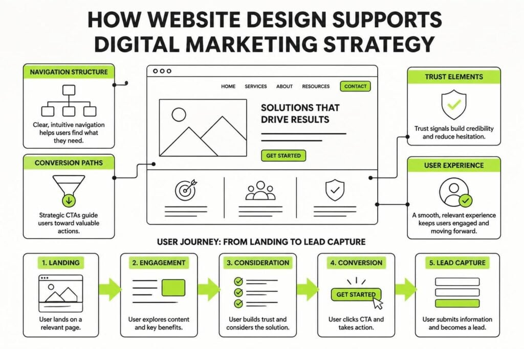
Your website isn't just a digital brochure. It's the engine room of your entire marketing system. When you run paid ads, send email campaigns, or publish content, every single action points back to your site. If the design doesn't support the marketing goal, you're burning budget and losing leads. Website design for digital marketing needs to do more than look good. It needs to guide visitors, build trust fast, and make the next step obvious. Most business owners treat design and marketing as separate projects. That's where things fall apart.
Why Website Design for Digital Marketing Works Differently
Marketing-driven design starts with the user's intent, not just aesthetics. When someone clicks your ad or opens your email, they arrive with a question or a problem. Your site has about three seconds to prove it's the right place.
Traditional websites prioritise:
- Brand storytelling
- Visual impact
- Company history
- Comprehensive information dumps
Marketing-focused websites prioritise:
- Immediate clarity on what you offer
- Fast paths to conversion
- Trust signals positioned strategically
- Reduced friction at every step
The difference shows up in your conversion rates. A beautifully designed site that confuses visitors converts worse than a simple site that answers their question and makes the offer clear. Website design that supports digital marketing aligns every visual choice with user behavior and campaign goals.
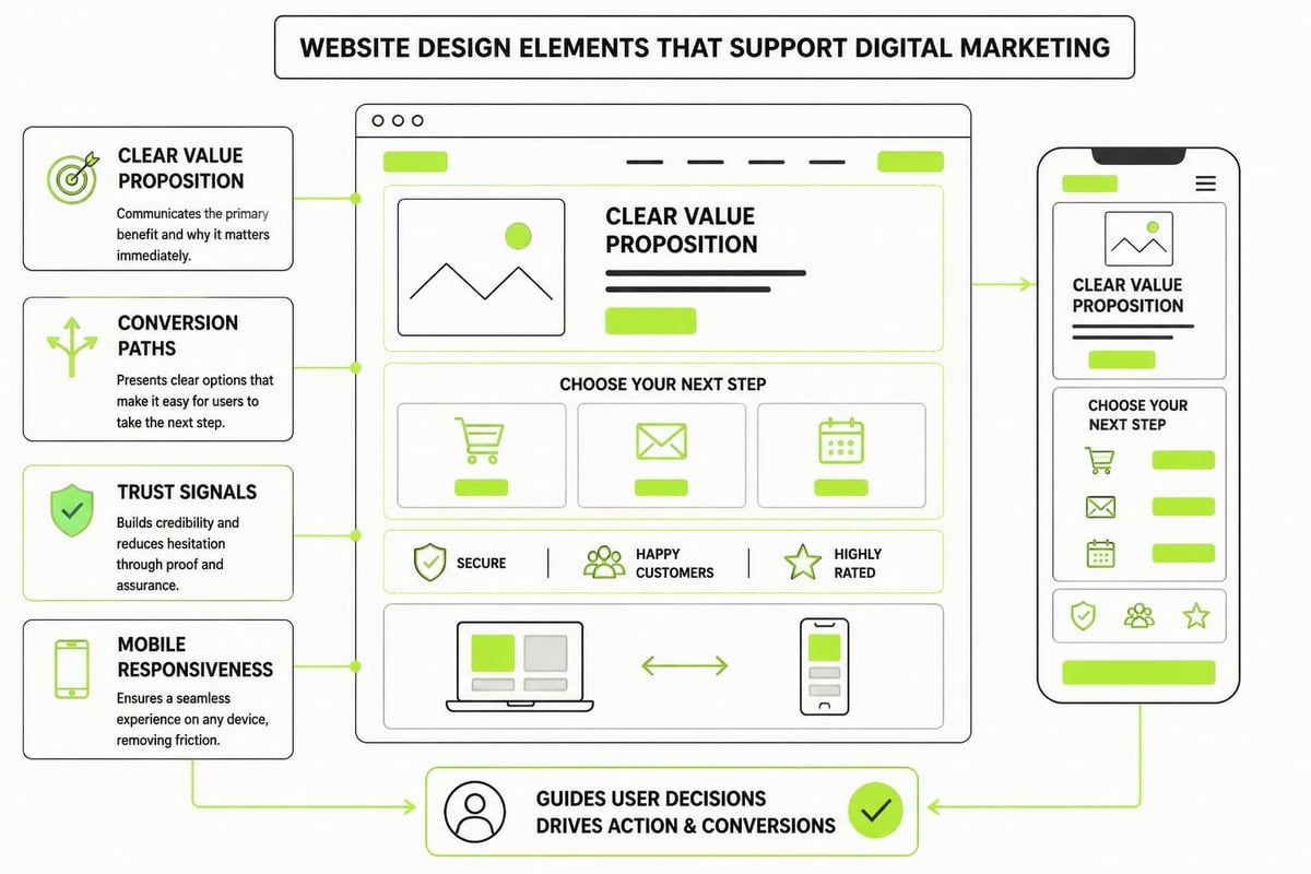
Navigation That Supports Campaign Flow
Your main menu isn't just a list of pages. It's a conversion tool. When someone lands on your site from a LinkedIn ad about CRM automation, they shouldn't have to hunt through five menu layers to find relevant information.
Designing Navigation for Intent
Group your navigation around user goals, not internal departments. Instead of "About," "Services," "Team," and "Blog," think about what people actually want to do.
| Traditional Navigation | Marketing-Driven Navigation |
|---|---|
| About Us | How It Works |
| Our Services | Solutions |
| Meet The Team | Results |
| Resources | Get Started |
| Contact | Free Assessment |
The marketing version tells visitors exactly where to go based on their stage of awareness. Someone ready to buy goes straight to "Get Started." Someone researching options explores "Solutions" or "Results."
Keep your main navigation to five items maximum. Every additional option increases decision fatigue. If you need more pages, use footer navigation or contextual links within content.
Mobile Navigation Matters More
Over 60% of web traffic comes from mobile devices in 2026. If your navigation requires pinch-zooming or multiple taps to find basic information, you're losing leads before they engage. Responsive design and intuitive navigation aren't optional features anymore. They're baseline requirements.
Hamburger menus work, but make sure your most important action (usually "Contact" or "Get Started") stays visible as a button, even when the menu is collapsed. Don't hide your conversion point.
Building Trust Before You Ask for Anything
People are skeptical. They've been burned by hollow promises and flashy websites that underdeliver. Website design for digital marketing needs to address that skepticism immediately.
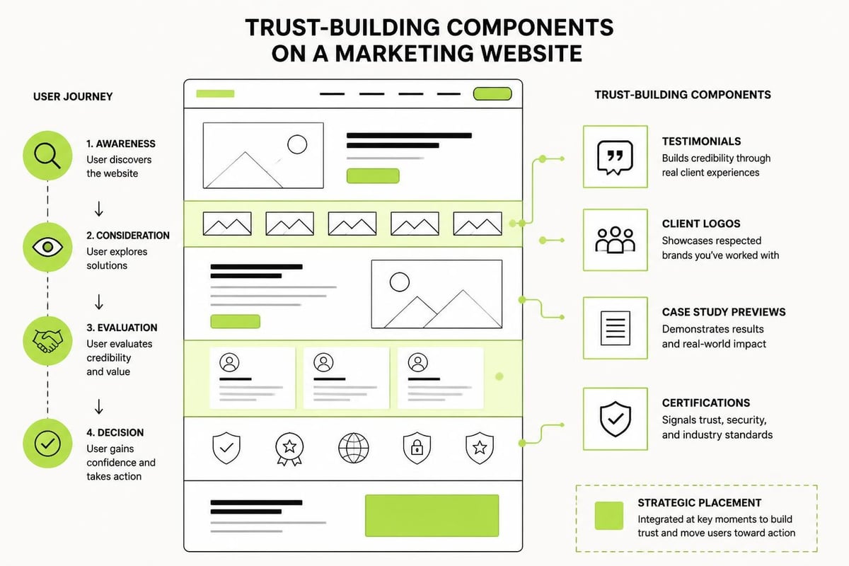
Trust signals that actually work:
- Client logos from recognizable companies
- Specific results with numbers ("47% increase in qualified leads")
- Video testimonials showing real faces
- Case studies with detailed breakdowns
- Industry certifications or awards
- Security badges near forms
- Clear privacy policies linked in footers
Notice what's not on that list: stock photos of people shaking hands in suits. Generic "award" badges from unknown organizations. Vague testimonials without names or companies.
Place your strongest trust signals above the fold on your homepage and landing pages. Case studies that showcase measurable results work particularly well for service businesses because they prove you've solved the exact problem your visitor is facing.
Forms That Don't Scare People Off
Every field you add to a contact form decreases conversion rates. If you're asking for company size, annual revenue, preferred contact time, and a detailed description of their problem, you're creating friction.
Start with the minimum: name and email. Maybe phone number if you're calling leads directly. Everything else can wait until after they've shown interest. You can always gather more information during the sales conversation.
Position forms where they make sense in the journey. Don't interrupt someone reading your service overview with a popup form. Wait until they've consumed enough information to make a decision. Tools like website builders with strong conversion features let you test different form placements and field combinations without rebuilding your entire site.
Page Speed Affects Every Marketing Channel
A slow website kills conversions across every channel. Your Google Ads might be perfectly targeted, your landing page copy might be brilliant, but if it takes six seconds to load, half your visitors are gone.
Page speed impacts:
- Paid search performance – Google factors site speed into Quality Score
- SEO rankings – Core Web Vitals are ranking signals
- Ad platform costs – Faster landing pages improve conversion rates, lowering cost per acquisition
- User patience – Every second of delay costs conversions
Compress images before uploading. A 4MB hero image might look crisp, but it's murdering your load time. Aim for under 200KB per image without visible quality loss.
Remove unnecessary plugins and scripts. Every third-party tool you add (chat widgets, analytics trackers, social feeds) creates another request that slows things down. Audit what you actually use and kill the rest.
Use a content delivery network (CDN) to serve assets from servers close to your visitors. If you're based in Sydney but have clients in Singapore and Melbourne, a CDN ensures fast load times regardless of location.
Converting Attention Into Leads With Clear CTAs
Every page needs a job. Homepage converts awareness into interest. Service pages convert interest into consideration. Case studies convert consideration into action. If a page doesn't have a clear next step, it's dead weight.
Writing Calls to Action That Work
"Learn More" is not a compelling CTA. It's vague and low-commitment, which sounds good but actually reduces clicks because people don't know what they're getting.
Weak CTAs:
- Learn More
- Click Here
- Submit
- Get Started (too generic)
Strong CTAs:
- Download the 7-Step Marketing Plan
- Book Your Free Strategy Session
- See How We Increased Leads by 67%
- Get Your Custom Quote
The difference is specificity. Strong CTAs tell people exactly what happens when they click. No surprises, no confusion.
Use action verbs and create urgency where honest. "Book" feels more concrete than "Schedule." "Download Your Free Guide" works better than "Access Resources."
Having a structured approach to turning attention into predictable demand starts with understanding what your marketing needs to accomplish at each stage. The 7-Step Marketing Plan framework breaks down exactly how websites, CRMs, and campaigns work together to create that repeatable system.
Content Layout That Guides the Eye
How you arrange information matters as much as what you say. People don't read websites. They scan. Design needs to work with that behavior, not against it.
Use visual hierarchy strategically:
- Headlines grab attention first
- Subheadings break up text and create entry points
- Bullet points make benefits scannable
- Bold text highlights key phrases
- White space prevents overwhelm
Left-aligned text reads faster than centered blocks. Keep line length between 50-75 characters for comfortable reading. Walls of text kill engagement no matter how good the writing is.
Break up long sections with images, but make sure they're relevant. Random stock photos add nothing. Screenshots of your actual work, diagrams explaining your process, or photos of real results prove you know what you're talking about.
Essential website design practices focus on making information easy to find and act on. If visitors have to work to understand what you do or how to contact you, they won't.
Homepage Structure for Marketing Campaigns
Your homepage gets the most traffic, but it's often the least optimized page. People treat it like a catch-all for every possible message, which dilutes effectiveness.
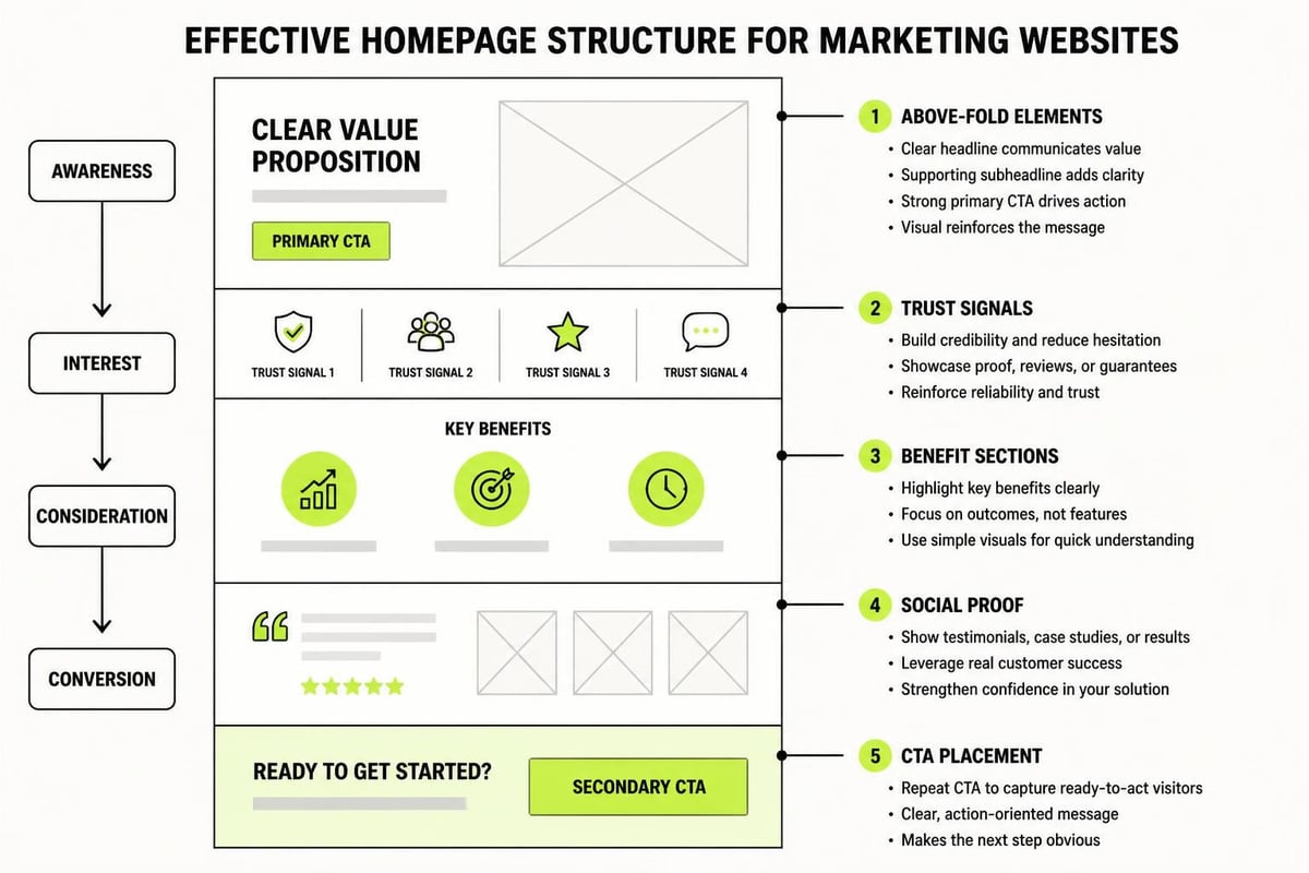
Above the Fold (First 600 pixels)
Answer three questions immediately:
- What do you do?
- Who is it for?
- What should I do next?
That's it. You don't need your entire service list, company history, and mission statement crammed into the top section. One clear headline, one supporting sentence, and one prominent CTA.
Middle Section
This is where you build credibility and address objections. Social proof works well here. Client logos, testimonial quotes, or a quick stats snapshot ("Over 200 businesses helped scale their marketing systems").
Three-column benefit sections work if each benefit is specific. "Increase conversions" is vague. "Turn 40% more website visitors into qualified leads" is concrete.
Lower Section
End with a secondary CTA for people who aren't ready for the primary action yet. If your main CTA is "Book a Call," your secondary might be "Read Our Case Studies" or "Download Our Guide."
Don't bury your contact information. Link to your contact page in the footer and main navigation at minimum.
Landing Pages Built for Conversion
Campaign landing pages are different from your main website pages. They have one goal: convert traffic from a specific source. That means removing distractions and matching message to medium.
If your Facebook ad promises a free marketing assessment, your landing page headline should echo that exact promise. Don't make people hunt for what they clicked through to get.
Landing page essentials:
- Match ad copy in headline
- Remove main navigation (reduces exit points)
- One clear CTA repeated 2-3 times
- Short form (3-5 fields maximum)
- Trust signals relevant to the offer
- Mobile-optimized always
Test different variations. Change headlines, move forms, try different CTA button colors. Small changes can create significant conversion lifts when you're sending paid traffic to these pages.
Tracking What Actually Matters
Beautiful website design for digital marketing means nothing if you can't measure results. Set up proper analytics before you launch campaigns, not after.
| Metric | Why It Matters | Target Range |
|---|---|---|
| Bounce Rate | Shows relevance and engagement | Under 60% |
| Average Session Duration | Indicates content quality | 2+ minutes |
| Pages Per Session | Measures interest depth | 2.5+ pages |
| Conversion Rate | Direct ROI measurement | 2-5% (varies by industry) |
| Form Completion Rate | Shows form effectiveness | 10-25% |
Track event completions, not just page views. Button clicks, video plays, scroll depth, form starts versus completions. These behaviors tell you where people engage and where they drop off.
Heat mapping tools show exactly where people click and how far they scroll. If your most important CTA is below where 80% of visitors stop scrolling, you've found your problem.
Making Design and Marketing Actually Work Together
The biggest mistake is treating your website as a design project instead of a marketing asset. Designers optimize for aesthetics and brand expression. That's important, but it's not the primary goal when you're trying to generate leads and drive revenue.
Your website exists to support your marketing and design strategy, not to win awards. Every design choice should answer: "Does this help convert visitors or does it just look nice?"
Sometimes those align. Often they don't. When they conflict, choose conversion. You can have a beautiful website that doesn't convert, but you can't scale a business on compliments about your color palette.
Start with your marketing goals, map out the user journey, identify conversion points, then design around those requirements. Not the other way around.
Maintaining Your Marketing Website
Launch isn't the finish line. Your website needs regular updates to stay effective as your business evolves and as visitor behavior changes.
Monthly maintenance:
- Check all forms are working
- Review analytics for drop-off points
- Update case studies with recent results
- Fix broken links
- Check mobile display on new devices
Quarterly reviews:
- A/B test key landing pages
- Update service descriptions
- Refresh testimonials
- Review and improve top-performing blog posts
- Audit site speed and fix slowdowns
Your marketing campaigns will change. Your offers will evolve. Your website needs to keep pace. Static sites become outdated sites, and outdated sites lose credibility fast.
Website design for digital marketing isn't a one-time project. It's an ongoing system that adapts to how people use it. The sites that convert best are the ones that get continuously refined based on real data, not assumptions about what should work.
Understanding how marketing and business development work together means recognizing your website as the central hub where every campaign, email, and ad needs to land effectively.
Getting website design for digital marketing right means building for conversion, not just appearance. Your site needs to guide visitors clearly, build trust quickly, and make taking action obvious at every stage. If you're ready to create a high-trust website backed by CRM infrastructure and data-driven marketing that actually generates predictable demand, MDO Digital helps service businesses remove the chaos and build systems that compound over time.