Marketing design sits at the intersection of visual communication and commercial intent. It's not decoration or art for its own sake. It's the deliberate application of design principles to move people through a decision-making process. When done properly, marketing design creates clarity, builds trust, and removes friction between someone discovering your business and becoming a paying client. The difference between design that converts and design that just looks nice comes down to structure, intention, and understanding how people make buying decisions.
What Marketing Design Actually Means
Most people think marketing design is about logos, colour palettes, and pretty Instagram posts. That's part of it, but it misses the point entirely.
Marketing design is a system. It's how your brand shows up across every touchpoint, from your website to your email campaigns to your proposals. It's the visual language that communicates who you serve, what you do, and why someone should trust you with their money.
The best marketing design does three things simultaneously:
- Establishes credibility and trust at first glance
- Guides attention toward the action you want someone to take
- Reinforces your positioning and messaging consistently
When these elements align, design becomes infrastructure. It stops being a subjective creative exercise and starts functioning as a predictable conversion mechanism. That's when businesses scale.
The Difference Between Branding and Marketing Design
Branding is your identity. Marketing design is how you deploy that identity to generate demand.
Your brand includes your values, positioning, voice, and visual system. It's the foundation. Marketing design takes those elements and applies them across campaigns, landing pages, email sequences, and sales collateral with a specific goal in mind: conversion.
Think of it this way. Your brand is the house. Marketing design is how you arrange the furniture, light the rooms, and guide people from the front door to where you want them to sit down. One is strategic positioning. The other is tactical execution.
Core Principles That Make Marketing Design Work
Good marketing design isn't about following trends or copying what works for someone else. It's about applying principles that align with how humans process information and make decisions.
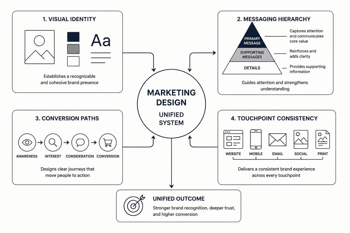
Visual Hierarchy Controls Attention
People don't read marketing materials. They scan them. Your job is to direct that scan toward the most important information in the right order.
Visual hierarchy uses size, contrast, colour, and spacing to create a clear path through your content. Headlines should dominate. Subheadings should create structure. Body copy should support. Calls to action should stand out.
When hierarchy is weak, everything competes for attention. When it's strong, the viewer's eye moves exactly where you want it to go. This isn't art. It's architecture.
| Element | Purpose | Treatment |
|---|---|---|
| Headline | Capture attention, state benefit | Largest, boldest, high contrast |
| Subheading | Create structure, maintain interest | Medium weight, clear separation |
| Body Copy | Explain, persuade, provide detail | Readable size, adequate spacing |
| Call to Action | Drive conversion | High contrast, isolated, action-oriented |
Consistency Builds Recognition and Trust
Every time someone encounters your business, they're either confirming or questioning their assumptions about you. Inconsistent design creates doubt.
If your website looks professional but your emails look like they were designed in 2008, you're creating friction. If your social posts use one colour palette and your landing page uses another, you're diluting recognition.
Design best practices emphasise the importance of brand consistency across all marketing channels. This doesn't mean everything looks identical. It means everything feels connected. Same fonts. Same colour system. Same tone. Same level of quality.
Consistency compounds trust over time. Inconsistency compounds doubt.
White Space Creates Clarity
Amateur marketing design tries to fill every pixel with content, features, and calls to action. Professional marketing design understands that space is a design element.
White space (or negative space) gives content room to breathe. It reduces cognitive load. It makes important elements stand out by creating contrast with emptiness.
A crowded design signals desperation or confusion. A design with generous spacing signals confidence and clarity. Which one makes you feel more comfortable spending money?
Marketing Design Across Different Channels
The principles stay consistent, but the application changes based on the medium and the user's context.
Website Design That Converts
Your website is often the first serious interaction someone has with your business. It needs to do several jobs at once: establish credibility, communicate value, answer objections, and move people toward a conversion action.
User experience best practices for marketing websites focus on intuitive navigation and customer-centric design. This means thinking about the questions someone has at each stage of their decision process and designing the experience to answer those questions in sequence.
Good website marketing design includes:
- Above-the-fold clarity showing who you serve and what you do
- Strategic use of social proof placed near conversion points
- Clear conversion paths that reduce decision fatigue
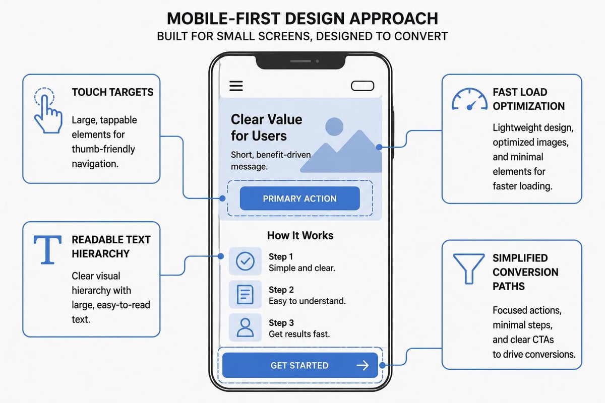
- Mobile-first layout that works on every screen size
- Fast load times that don't punish visitor patience
The structure matters as much as the aesthetics. A beautiful website that's confusing to navigate converts poorly. A simple website with clear paths converts well. Branding and advertising work together when the visual system supports the conversion architecture.
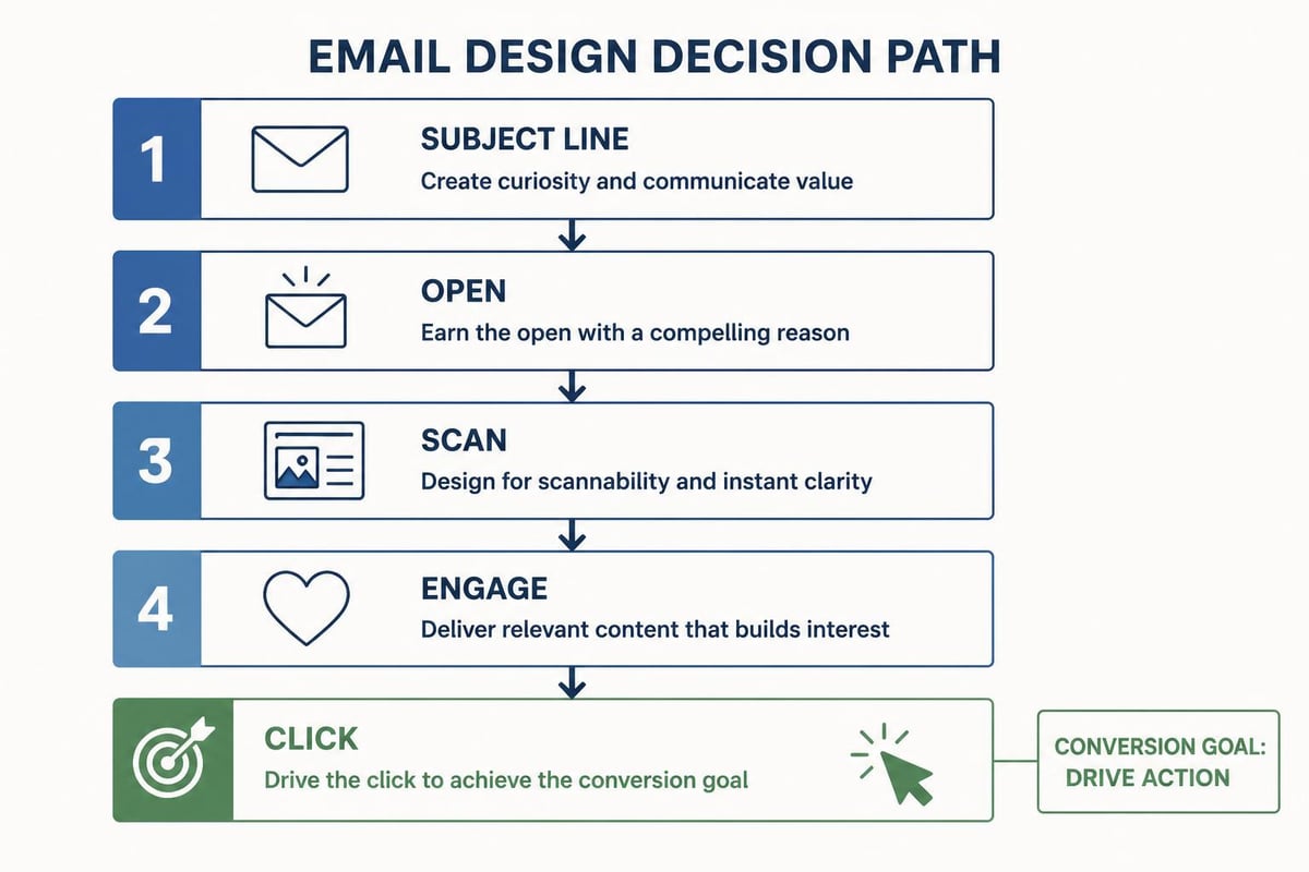
Email Design That Gets Opened and Clicked
Email is a direct channel where design needs to serve function ruthlessly. People scan emails faster than any other medium. You have seconds.
Email design best practices include maintaining a strong image-to-text ratio, ensuring mobile responsiveness, and creating clear visual hierarchy. But the most important principle is simplicity.
One email should have one goal. If you're asking someone to book a call, don't also ask them to download a resource, follow you on social, and read three blog posts. Every additional ask dilutes the primary conversion.
Key email design elements:
- Preheader text that extends the subject line's promise
- Scannable structure using short paragraphs and bullet points
- Single clear CTA that stands out visually
- Mobile-optimised layout that works on small screens
- Brand-consistent header that creates instant recognition
The design should guide someone from the subject line to the call to action in a straight line. No detours. No distractions.
Landing Page Design That Eliminates Friction
A landing page has one job: convert traffic into leads or customers. Everything else is noise.
Unlike your main website, a landing page should have no navigation, no external links, and no escape routes. It's a closed conversion environment designed to move someone toward a single decision.
The structure typically follows this pattern:
- Headline and subheadline that match the traffic source
- Hero image or video that reinforces the promise
- Benefits presented as outcomes, not features
- Social proof positioned near the main CTA
- Clear, specific call to action
- Optional FAQ section to handle objections
Marketing design on landing pages uses contrast, directional cues, and button design to create visual momentum toward the conversion action. The page should feel inevitable, not pushy.
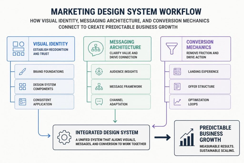
Building a Marketing Design System
Individual assets are fine, but systems create leverage. A marketing design system is a collection of reusable components, templates, and guidelines that ensure consistency and speed up execution.
Templates That Scale
Instead of designing every email, social post, or ad from scratch, create templates with consistent structure and flexible content areas.
This doesn't limit creativity. It channels it. You're not redesigning the wheel every time. You're focusing creative energy on messaging and offers while the visual system handles consistency.
Good template categories include:
- Email campaign templates for different funnel stages
- Social media post templates for different content types
- Landing page templates for different conversion goals
- Ad templates for different platforms and objectives
- Presentation templates for proposals and decks
Templates also make delegation easier. When your system is documented, other people can execute marketing design without constant art direction.
Brand Guidelines That Actually Get Used
Most brand guidelines sit in a PDF that nobody opens. Useful brand guidelines are accessible, practical, and include real examples.
Your guidelines should cover:
| Component | What to Document | Why It Matters |
|---|---|---|
| Colour Palette | Primary, secondary, and accent colours with hex codes | Ensures visual consistency across platforms |
| Typography | Font families, sizes, weights, and usage rules | Maintains readability and brand recognition |
| Logo Usage | Variations, spacing rules, and what not to do | Protects brand integrity |
| Image Style | Photography style, filters, composition guidelines | Creates cohesive visual language |
| Voice and Tone | Writing style, vocabulary, and examples | Aligns written and visual communication |
The best systems include a component library showing how elements combine. This turns guidelines from theory into execution.
Many businesses find that implementing a structured marketing plan helps them identify which design assets they actually need rather than creating content in isolation. When you build marketing design around a clear strategy, every asset has a purpose and a place in the conversion sequence.

Common Marketing Design Mistakes to Avoid
Even experienced businesses fall into predictable traps that undermine their marketing effectiveness.
Designing for Yourself Instead of Your Audience
Your personal aesthetic preferences don't matter. The only question that matters is: does this design communicate effectively to the people who will pay us money?
This is especially true in B2B service businesses. Your ideal client might be a 50-year-old business owner who values clarity over cleverness. Designing like you're targeting 25-year-old startup founders will miss the mark entirely.
Test your assumptions. Show your marketing design to people who match your buyer persona. Watch how they interact with it. Ask what confused them. Adjust based on behaviour, not opinions.
Following Design Trends at the Expense of Conversion
Trends come and go. Conversion principles don't. That minimalist design style that's popular right now might work for a fashion brand, but it might strip out the trust signals your service business needs.
Design principles should serve your commercial goals, not the other way around. If adding more testimonials makes your page "busier" but increases conversion by 30%, add the testimonials.
Effective marketing website design balances aesthetic appeal with functional performance. Sometimes the best-converting design isn't the prettiest one.
Neglecting Mobile Experience
More than half of web traffic comes from mobile devices in 2026. If your marketing design doesn't work perfectly on a phone, you're losing money.
Mobile-first design isn't just about responsive layouts. It's about:
- Touch-friendly buttons that are easy to tap accurately
- Readable text without zooming
- Fast load times on cellular connections
- Simplified navigation that works with thumbs
- Shorter forms that don't frustrate mobile users
Salesforce emphasises mobile responsiveness as a critical email design practice, and the same applies across all marketing channels. Design for mobile first, then enhance for desktop.
Overcomplicating the Message
Clever design that requires explanation has failed. Your marketing design should communicate instantly, not after someone studies it.
This means:
- Headlines that clearly state the benefit
- Imagery that reinforces the message, not decorates it
- Calls to action that say exactly what happens next
- Layouts that guide attention, not scatter it
Simplicity isn't dumbing down. It's respecting your audience's time and cognitive capacity. The clearer your marketing design, the faster people convert.
Measuring Marketing Design Performance
You can't improve what you don't measure. Marketing design should be evaluated on commercial outcomes, not aesthetic opinions.
Metrics That Matter
Different assets require different measurement approaches, but they all connect back to conversion and revenue.
For landing pages:
- Conversion rate (visitors to leads/customers)
- Bounce rate (people who leave immediately)
- Time on page (engagement indicator)
- Click-through rate on CTAs
For email campaigns:
- Open rate (subject line and sender effectiveness)
- Click-through rate (content and CTA performance)
- Conversion rate (ultimate campaign goal)
- Unsubscribe rate (message-market fit)
For website pages:
- Traffic sources and volume
- User flow and exit pages
- Form completion rates
- Goal completions and revenue attribution
When a design change improves conversion rates, keep it. When it doesn't, change it. Remove ego from the equation. Your job is to find what works, not to be right about your initial assumptions.
A/B Testing Design Elements
Small design changes can create significant conversion lifts. The only way to know is to test systematically.
Test one variable at a time:
- Headline variations with different value propositions
- CTA button colours, sizes, and copy
- Image choices and placements
- Form lengths and field requirements
- Social proof positioning and formats
Run tests long enough to reach statistical significance. A few dozen conversions isn't enough data. Aim for hundreds of completed actions per variation before drawing conclusions.
This disciplined approach to digital growth removes guesswork and builds a library of proven design decisions.
Making Marketing Design a Competitive Advantage
Most businesses treat marketing design as a commodity. They hire the cheapest designer or use templates without modification. This creates opportunity for businesses willing to invest in strategic design systems.
When your marketing design consistently outperforms competitors, you can afford to pay more for traffic. You can convert the same audience at higher rates. You can charge premium prices because your presentation signals premium value.
This isn't about spending more money. It's about applying design systematically as a conversion tool rather than treating it as decoration. It's building templates and systems that compound efficiency over time. It's measuring what works and doing more of it.
The businesses that win in 2026 won't necessarily have the flashiest design. They'll have the clearest design, executed most consistently, across every touchpoint that matters. They'll understand that marketing design is infrastructure, not art. And they'll build accordingly.
Marketing design works when it serves commercial intent without compromise. The visual system should guide attention, build trust, and remove friction between discovery and conversion. When you approach design as infrastructure rather than decoration, it becomes a predictable driver of business growth rather than a subjective creative expense. MDO Digital helps service-based businesses build marketing systems that convert attention into predictable demand through high-trust design, CRM infrastructure, and data-driven execution. If you're ready to remove chaos and create structured growth, let's talk.