Your website isn't a digital brochure. It's a lead generation system. Too many service businesses treat marketing website design as a creative project when it should be infrastructure. The difference between a site that looks good and one that converts consistently comes down to systems thinking. You need clarity in messaging, friction removed from user paths, and structured conversion architecture that protects every visitor. When you get the fundamentals right, your website becomes predictable demand generation, not a cost center hoping for traffic.
The Real Job of Marketing Website Design
Most websites fail because they're built backwards. They start with aesthetics and bolt on strategy later. Effective marketing website design starts with understanding exactly what action you need visitors to take and designing backward from that outcome.
Your site has one primary job: move qualified visitors toward a decision. Everything else is secondary. That means your design decisions should be dictated by conversion architecture, not personal preference or what competitors are doing.
Structure Before Style
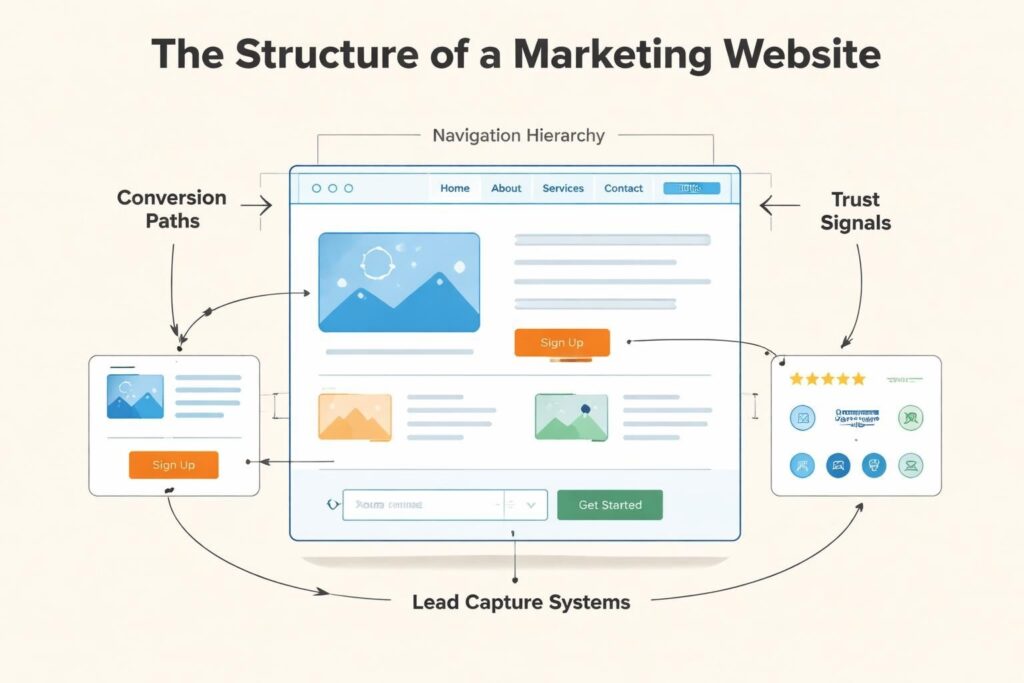
The foundation of good marketing website design lives in information architecture. Before you choose fonts or colors, map out:
- User journeys by awareness stage (problem unaware, solution aware, product aware)
- Conversion paths for different service tiers (entry offers vs. premium engagements)
- Trust-building sequences (proof points, case studies, testimonials positioned strategically)
- Lead capture mechanisms at appropriate friction points
When you design with structure first, style becomes simpler. You're not guessing where elements go. You're building a system that guides people naturally toward conversion.
Service businesses especially need this clarity. Your buyers need education, proof, and confidence before they'll book a call. Your site architecture should deliver all three without making them hunt.
Core Elements That Actually Move the Needle
Let's cut through the noise. Marketing website design comes down to a handful of elements that matter more than everything else combined.
Clear Value Proposition
Your homepage should answer three questions in under five seconds:
- What do you do?
- Who do you do it for?
- What outcome do you deliver?
If a visitor needs to scroll, read three paragraphs, or click around to understand your offer, you've already lost them. This isn't about being clever. It's about being immediately clear.
Navigation That Removes Friction
Navigation should feel invisible. When someone has to think about where to find information, you've introduced friction. Keep your main navigation to five items maximum. Any more and you're asking people to make decisions instead of taking action.
| Navigation Element | Purpose | Max Items |
|---|---|---|
| Primary Nav | Core service pages + contact | 5 |
| Footer Nav | Resources, policies, secondary pages | 10-12 |
| Utility Nav | Login, support, language (if needed) | 3-4 |
Your navigation isn't about showing everything you do. It's about guiding people to the pages that convert. Strong navigation structure reduces cognitive load and keeps visitors moving forward.
Trust Signals Positioned Strategically
Testimonials buried on a separate page don't work. Trust needs to be built exactly when doubt appears. That's usually:
- Right after you state your value proposition
- Before asking for contact information
- On service pages where someone evaluates fit
- Near pricing (if you show it)
Case studies, client logos, specific results, and social proof should appear contextually. If you're explaining how you solve a problem, show proof you've done it before. Immediately.
For branding and marketing work, trust might be the single biggest conversion factor. People hire based on confidence, and your site needs to build it systematically.
Conversion Architecture That Protects Leads
Here's where most marketing website design falls apart. You get traffic, people browse, and then they leave. No inquiry. No download. No conversion. The problem isn't traffic quality. It's conversion architecture.
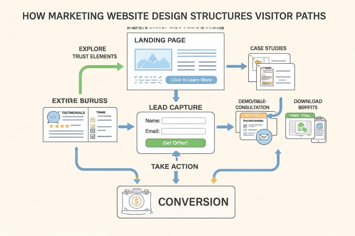
Progressive Engagement Model
Not everyone who visits your site is ready to book a call. Your job is to capture them at their current stage of readiness and move them forward.
Build a tiered conversion system:
- Low commitment (newsletter, resource download, calculator)
- Medium commitment (webinar, email course, assessment)
- High commitment (consultation, proposal request, direct inquiry)
Each tier should have clear calls to action positioned where they make sense. Someone reading a blog post might download a guide. Someone on your services page might book a call.
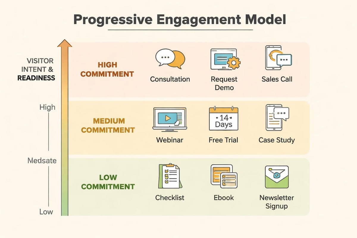
The key is giving people something to do that matches their intent. Marketing systems design means building these paths deliberately, not hoping people figure it out.
Forms That Don't Kill Conversion
Every form field you add drops conversion rate. Ask only what you absolutely need to qualify and follow up. Name, email, and one qualifier question is usually enough for initial capture.
Save the detailed discovery for the follow-up. Your form's job is to start the conversation, not complete due diligence.
Position forms strategically:
- After you've delivered value (blog post, case study, tool)
- When someone has shown buying intent (pricing page, service details)
- As exit intent offers (last chance capture)
And please, test your forms on mobile. If someone can't easily complete it on their phone, you're losing conversions.
Technical Foundation Most People Ignore
Pretty design on a slow, broken site is like putting a nice sign on a shop that's never open. The technical side of marketing website design isn't optional.
Speed Is a Feature
Site speed directly impacts conversion. A one-second delay in load time can drop conversions by 7%. For service businesses where leads are worth thousands, that's real money.
Optimize for speed by:
- Compressing images properly (WebP format where supported)
- Minimizing scripts and plugins
- Using a quality host (not the $3/month option)
- Implementing lazy loading for below-fold content
- Enabling browser caching
Web design best practices consistently emphasize speed because it affects both user experience and search rankings.
Mobile-First Is Non-Negotiable
More than 60% of web traffic comes from mobile devices in 2026. If your marketing website design doesn't work perfectly on phones, you're turning away the majority of your traffic.
Mobile-first doesn't mean mobile-only. It means designing for the smallest screen first, then enhancing for larger displays. This forces you to prioritize what matters and remove clutter.
Test everything on actual devices. Simulators miss real-world issues like tap target size, form usability, and readability.
SEO Built In, Not Bolted On
Search visibility isn't a marketing add-on. It's core infrastructure. Your marketing website design should include:
- Semantic HTML structure (proper heading hierarchy, meaningful tags)
- Optimized page speed (covered above, but worth repeating)
- Clean URL structure (readable, keyword-inclusive paths)
- Internal linking architecture (connects related content logically)
- Schema markup (helps search engines understand your content)
When you integrate SEO from the start, it compounds over time. Sites that treat it as an afterthought spend years catching up.
Content Strategy That Supports Conversion
Design gets people to stay. Content gets them to convert. Your marketing website design needs a content strategy that works as hard as the visuals.
Writing That Speaks to Intent
Every page should target specific user intent. Someone on your homepage has different questions than someone reading a case study or evaluating your services page.
Match content to intent:
| Page Type | Primary Intent | Content Focus |
|---|---|---|
| Homepage | Understand offering | Clear value prop, primary CTAs, trust signals |
| Service Pages | Evaluate fit | Specific outcomes, process, proof, pricing indicators |
| About Page | Build trust | Story, team, values, differentiation |
| Case Studies | See proof | Problem, solution, results (quantified) |
| Blog Posts | Learn/research | Education, thought leadership, related CTAs |
Don't write generic content hoping it works everywhere. Be specific about what each page needs to accomplish.
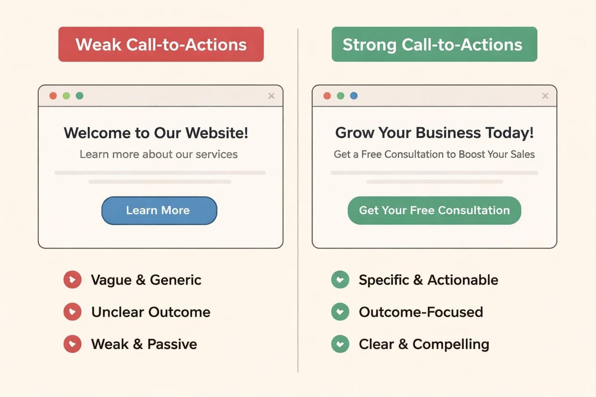
Calls to Action That Actually Work
Weak CTAs kill conversion. "Learn more" and "click here" tell people nothing about what happens next. Strong CTAs are specific and outcome-focused.
Instead of generic buttons, use:
- "Get Your Custom Growth Plan"
- "Download the Lead Generation Framework"
- "Book a 20-Minute Strategy Call"
- "See How We Solved This for [Similar Business]"
Your CTA should clearly state what the visitor gets and what happens next. Remove uncertainty and you remove friction. The same principle applies whether you're focused on digital marketing systems or pure design work.
Design Patterns That Convert Consistently
Certain marketing website design patterns work because they align with how people actually use websites. You don't need to reinvent the wheel. You need to implement what's proven.
Above-the-Fold Strategy
What people see before scrolling determines whether they stay. Your above-the-fold section should include:
- Clear headline (what you do, who for)
- Supporting subhead (key benefit or differentiator)
- Primary CTA (most important action)
- Visual element (hero image, video, or product visual)
- Trust indicator (client logos, testimonial snippet, or proof point)
This isn't a formula to copy exactly. It's a framework to ensure you're communicating the essentials immediately. Effective web design practices consistently show that clarity beats creativity when it comes to conversion.
Social Proof Placement
Testimonials work best when they're specific and positioned contextually. Generic praise doesn't build trust. Specific outcomes do.
Good testimonial structure:
- Before state (what problem they had)
- Specific result (quantified outcome)
- Attribution (name, title, company, photo if possible)
Place these where people need reassurance: near CTAs, on service pages, before contact forms. Don't hide them on a testimonials page nobody visits.
Visual Hierarchy That Guides Attention
People don't read websites. They scan. Your job is to guide their scanning pattern toward conversion elements using visual hierarchy.
Use size, color, contrast, and whitespace to create clear priority:
- Largest/boldest elements are most important (headlines, CTAs)
- Color draws attention to action items
- Whitespace separates sections and reduces overwhelm
- Alignment creates visual relationships between elements
When everything screams for attention, nothing gets it. Choose what matters most and make it obvious.
Maintenance and Optimization Systems
Launching your marketing website design isn't the finish line. It's the starting line. Your site needs ongoing optimization based on real user behavior.
Analytics That Inform Decisions
Install proper tracking from day one:
- Google Analytics 4 (user behavior, traffic sources)
- Heatmapping tool (Hotjar, Microsoft Clarity)
- Form analytics (where people drop off)
- Conversion tracking (which paths lead to leads)
Don't just collect data. Review it monthly and make changes based on what you learn. If people bounce from your services page, that's feedback. If they scroll past your CTA, it needs work.
A/B Testing What Matters
Test changes systematically. Don't redesign based on opinions. Test:
- Headlines (clarity variations)
- CTAs (copy and placement)
- Form length (required fields)
- Trust signal placement (above vs. below fold)
- Page layouts (single column vs. multi-column)
Run tests long enough to get statistical significance. One week usually isn't enough unless you have massive traffic.
Content Updates and Freshness
Outdated content signals neglect. Review and update your site quarterly:
- Replace old dates and references
- Update case studies with recent work
- Refresh testimonials to show current clients
- Add new content based on customer questions
- Remove or redirect dead pages
Search engines favor fresh, maintained sites. More importantly, potential clients notice when your latest case study is from 2022.
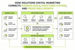
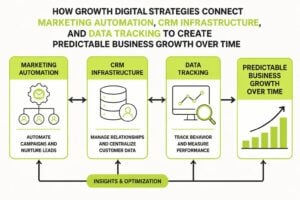
Integration With Broader Marketing Systems
Your website doesn't exist in isolation. Effective marketing website design connects to your CRM, email systems, and advertising platforms to create unified lead flow.
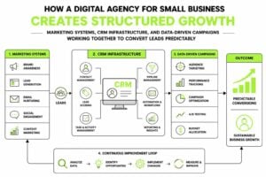
CRM Integration
Every form submission should flow directly into your CRM with proper tagging and routing. Manual entry wastes time and loses leads.
Connect your site to your CRM so:
- Leads are captured automatically
- Contact information is enriched where possible
- Follow-up sequences trigger based on source
- Lead scoring happens based on behavior
This is where marketing systems thinking separates functional sites from strategic ones. Your website should feed your entire demand generation engine.
Email Marketing Connection
Capture should trigger relevant nurture sequences. Someone who downloads a pricing guide should receive different emails than someone who reads a blog post about brand strategy.
Build segmented email flows triggered by:
- Content downloads
- Page visits (using tracking pixels)
- Form submissions
- Service interest signals
Your marketing website design should make segmentation easy through smart forms and tracking.
Advertising Integration
If you're running paid traffic, your landing pages need specific design considerations:
- Message match between ad and landing page
- Remove navigation (fewer exit points)
- Single, clear CTA aligned with ad promise
- Faster load times (paid traffic is expensive)
Dedicated landing pages for paid campaigns almost always outperform sending traffic to your homepage. Build templates that make creating campaign-specific pages efficient.
Marketing website design done right removes chaos from your lead generation and creates predictable growth. When structure, conversion architecture, and technical foundation align, your site becomes an asset that compounds over time instead of a cost that needs constant attention. If you're ready to build a high-trust website that feeds your entire marketing system, MDO Digital can help you design infrastructure that protects every lead and scales with clarity.