Your website isn't a brochure. It's the central piece of your marketing infrastructure, and if it's not converting visitors into leads, it's failing at its core job. Most service businesses treat website design for marketing as a one-off project when it should be a strategic system built to capture, qualify, and convert attention into revenue. The difference between a site that generates enquiries and one that collects digital dust comes down to how well design, messaging, and technical execution work together. This isn't about aesthetics or following trends. It's about building a high-trust environment that removes friction, answers objections, and makes it stupid-easy for someone to take the next step with you.
The Core Function of Website Design for Marketing
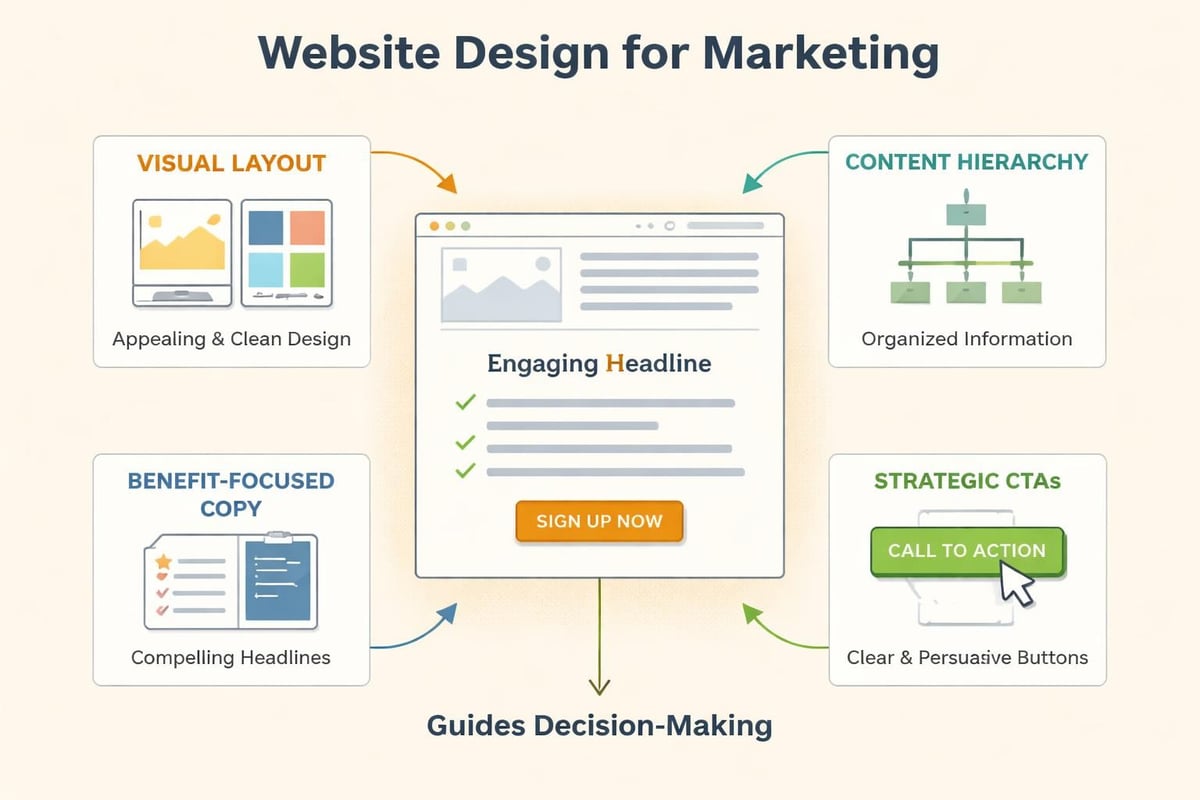
Website design for marketing exists to do one thing: turn strangers into customers. Everything else is secondary. Your design choices should create clarity, build trust, and guide people toward a conversion action without them having to think too hard about it.
This starts with understanding what visitors actually need when they land on your site. They're not looking for clever copy or flashy animations. They want to know:
- What you do
- Whether you can solve their problem
- What happens next
- Why they should trust you over someone else
Your design must answer these questions immediately, preferably above the fold. If a visitor has to scroll, click, or guess to understand your offer, you've already lost most of them.
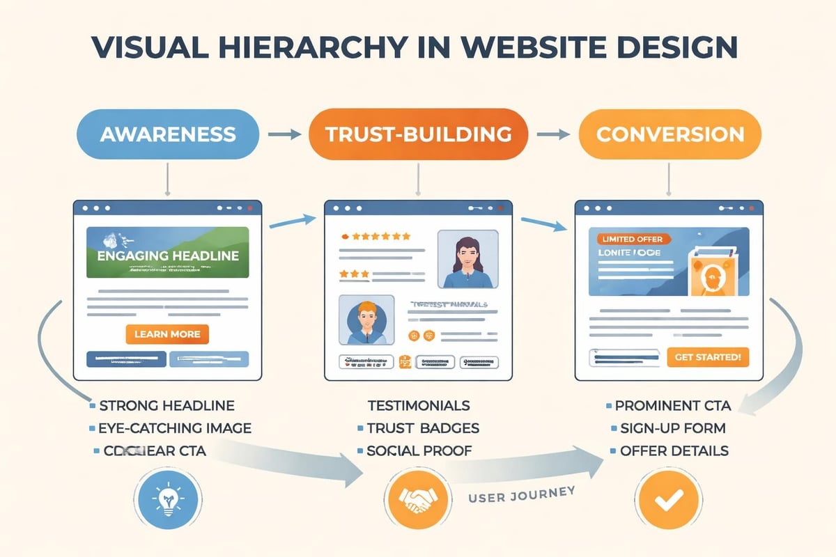
The visual hierarchy should reflect these priorities. Headlines carry the main message. Subheadings add context. Design elements like contrast, whitespace, and directional cues point people toward your call to action. This isn't decoration, it's architecture.
Structure That Supports Conversion
Effective website design for marketing follows a predictable structure because it works. Service-based businesses need:
- A clear value proposition that explains the outcome, not the process
- Social proof positioned where doubt typically appears
- A single, obvious next step on every page
- Navigation that doesn't compete with your primary conversion goal
Compare this to most agency sites, which try to be everything to everyone. Multiple CTAs. Clever navigation. Services listed without context. It creates decision fatigue, and decision fatigue kills conversions.
When someone visits MDO Digital, they see exactly what we do and who we do it for within three seconds. That's not an accident. It's intentional website design for marketing that prioritizes clarity over creativity.
| Design Element | Purpose | Common Mistake |
|---|---|---|
| Hero Section | Communicate value instantly | Vague headlines, no CTA |
| Navigation | Support exploration without distraction | Too many options competing |
| Social Proof | Build trust at decision points | Generic testimonials with no context |
| Forms | Capture leads with minimal friction | Asking for unnecessary information |
The Technical Side That Most Agencies Ignore
Beautiful design means nothing if your site loads slowly, breaks on mobile, or can't be found in search. Website design for marketing must include technical performance as a core feature, not an afterthought.
Page speed directly impacts conversion rates. Research shows that a one-second delay in load time can reduce conversions by 7%. For a service business doing $500k annually, that's $35,000 left on the table because your hero image is too large or your hosting is cheap.
Mobile responsiveness isn't optional anymore. More than 60% of traffic comes from mobile devices, and Google prioritizes mobile-first indexing. If your site doesn't work perfectly on a phone, you're losing both traffic and rankings. This means testing actual devices, not just resizing your browser window.
Built-in marketing and SEO tools can make the difference between a site that generates organic leads and one that depends entirely on paid traffic. Technical SEO foundations like proper heading structure, meta descriptions, alt text, and schema markup should be baked into your design process, not bolted on later.
Integration with Marketing Systems
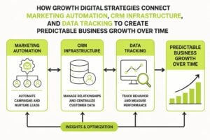
Website design for marketing doesn't exist in isolation. It needs to connect with your CRM, email platform, analytics, and automation tools. Without these connections, you're flying blind.
Every form should feed directly into your CRM with proper tagging and source tracking. You need to know which pages drive enquiries, which traffic sources convert best, and where people drop off. This data informs everything from content marketing strategy to ad spend allocation.
Consider these integration points:
- Email capture connected to segmented nurture sequences
- Form submissions that trigger instant qualification workflows
- Chat widgets that route to the right team member based on page context
- Analytics tracking micro-conversions, not just form fills
Most businesses treat their website as separate from their marketing stack. That's a mistake. The site should be the hub that connects everything else.
Design Elements That Build Trust Fast
Trust is the conversion bottleneck for service businesses. Someone might understand your offer and even want it, but if they don't trust you, they won't buy. Website design for marketing must address this reality on every page.
Visual consistency signals professionalism. Your fonts, colors, spacing, and imagery should follow a clear system. When things look thrown together, people assume your service delivery will be too. Branding consistency extends from your logo through every design choice on your site.
Social proof works best when it's specific. Instead of "Great to work with!" show testimonials that describe the actual problem solved and outcome achieved. Video testimonials carry even more weight because they're harder to fake. Case studies with real numbers and client names build credibility in a way generic reviews never will.
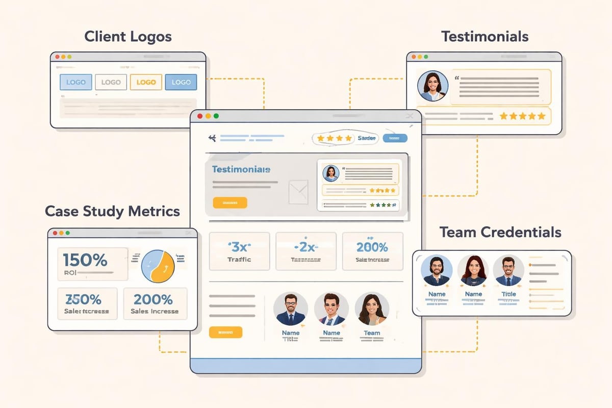
Transparency also builds trust. Show your team. Explain your process. Share your pricing structure if possible. The more you demystify what working with you looks like, the less risky it feels to reach out.
The Role of Professional Photography
Stock photos kill trust. Everyone recognizes them, and they signal that you couldn't be bothered to show your actual business. Website design for marketing should prioritize real photos of your team, office, process, and results.
This doesn't mean expensive production. Phone cameras are good enough if you have decent lighting. What matters is authenticity. Show your actual workspace. Feature real team members. Document your process with clients (with permission). These images create connection in a way polished stock photos never can.
Conversion-Focused Page Layout
Every page on your site should have one primary goal. Homepage? Get them to book a call or view your services. Service page? Move them to a case study or contact form. Blog post? Capture an email or drive to a related service.
Single-column layouts typically outperform multi-column designs for conversion-focused pages. Why? They create a linear path with fewer distractions. The visitor follows one flow from problem to solution to action.
Your call-to-action buttons need to stand out without looking desperate. High contrast colors work, but context matters more than color choice. The CTA should feel like the natural next step, not an interruption. Position them where people naturally pause: after explaining a benefit, following social proof, at the end of a section.
UX design best practices emphasize removing unnecessary friction. This means:
- Fewer form fields (ask only what you need to qualify the lead)
- Clear error messages when something goes wrong
- Visible progress indicators on multi-step forms
- Obvious confirmation after submission
Test your forms yourself. Better yet, watch someone else try to complete them. The friction points become obvious immediately.
| Page Type | Primary Goal | Key Design Elements |
|---|---|---|
| Homepage | Qualify and direct visitors | Clear positioning, service overview, primary CTA |
| Service Page | Educate and convert | Detailed outcomes, process explanation, case study link |
| About Page | Build trust and connection | Team bios, story, values, client logos |
| Contact Page | Minimize friction to reach out | Simple form, multiple contact options, response time expectation |
Content Structure Within Design
Website design for marketing isn't just visual. It's also how you structure and present information. The best-designed site won't convert if the copy is confusing or buried under jargon.
Use short paragraphs. Most people scan rather than read, so make your content scannable. Break up text with subheadings that communicate ideas independently. Someone should be able to understand your main points by reading only the headings.
Bullet points and numbered lists improve comprehension and retention. They also create visual breaks that make pages less intimidating. Compare a wall of text to a bulleted list of benefits, and the list wins every time for engagement.
Content hierarchy should match visual hierarchy. Your most important points get the most prominent placement. Supporting details come after. Don't bury your value proposition in paragraph three.
Writing for Clarity and Conversion
The best marketing website design pairs great visuals with sharp copy. Write like you talk. Avoid industry jargon unless your audience uses it daily. Explain complex ideas simply.
Every section should answer a potential objection or question. If someone's thinking "But how long does this take?" address it. If they're wondering "What makes you different?" tell them. Anticipate doubt and remove it before it becomes a reason not to act.
Include specific examples wherever possible. "We help businesses grow" means nothing. "We helped a consulting firm go from 3 to 15 qualified leads per month in 90 days" means everything. Specificity builds credibility.
Testing and Iteration
Website design for marketing is never finished. Launch is just the beginning. The sites that perform best are constantly tested and improved based on real user behavior.
Start with analytics. Which pages get the most traffic but don't convert? Where do people drop off? Which sources send qualified traffic versus tire-kickers? This data tells you where to focus improvement efforts.
A/B testing reveals what actually works versus what you think should work. Test headlines, CTA copy, button colors, form lengths, and page layouts. Run tests long enough to reach statistical significance. One week of data usually isn't enough.
Heatmaps and session recordings show how people actually use your site. You'll discover elements people ignore, sections that confuse them, and CTAs they never see. This qualitative data complements your quantitative analytics.
Common elements worth testing:
- Headline variations that emphasize different benefits
- CTA button text (specific vs. generic)
- Form placement (sidebar vs. end of page)
- Trust signals (where to position testimonials)
- Service page length (detailed vs. concise)
Case studies on strategic website design show that small changes can create significant results. A headline change might lift conversions 15%. A simplified form could double submissions. You won't know until you test.
Platform and Tool Selection
Choosing the right platform impacts everything from design flexibility to long-term maintenance costs. WordPress offers maximum control but requires more technical knowledge. Webflow provides design freedom with better performance. Squarespace simplifies everything but limits customization.
For service businesses focused on lead generation, the factors in selecting a website builder include integration capabilities, not just design options. Can it connect to your CRM? Does it handle forms well? Will it slow down as you add content?
Avoid platforms that lock you in or make migration difficult. Your business will evolve, and your site needs to evolve with it. Proprietary systems that don't export data cleanly create expensive problems later.
Consider total cost of ownership, not just setup costs. A cheap template might save money upfront but cost thousands in developer hours when you need custom functionality. A more expensive platform with better tools might actually be cheaper long-term.
The technical infrastructure supporting your website development and marketing efforts should enable growth, not constrain it. Choose platforms that scale as your traffic and complexity increase.
Mobile-First Design Approach
Website design for marketing must prioritize mobile experience from the start, not treat it as an afterthought. Mobile-first design means starting with the smallest screen and building up, ensuring core functionality works everywhere.
This approach forces prioritization. When you have limited screen space, you must decide what's truly essential. That discipline improves desktop design too by eliminating clutter.
Touch targets need to be large enough for fingers, not mouse pointers. Buttons should be at least 44×44 pixels. Space them apart so someone can't accidentally tap the wrong one. Forms should use appropriate input types (number pad for phone, email keyboard for email) to reduce friction.
Navigation patterns differ on mobile. Hamburger menus work fine despite what some designers claim, but your logo should always link home, and your primary CTA should be visible without opening the menu.
Test on actual devices regularly. Emulators help, but nothing replaces using your site on a real phone with a real connection. You'll discover issues that never show up in testing tools.
Loading Speed Optimization
Fast sites convert better and rank higher. Website design for marketing must include performance optimization as a core requirement, not a nice-to-have.
Image optimization provides the biggest wins for most sites. Use next-gen formats like WebP. Compress aggressively. Implement lazy loading so images only load when needed. A hero image shouldn't be 5MB when 200KB delivers the same visual quality.
Minimize HTTP requests by combining files where possible, using CSS instead of images for simple graphics, and removing unused code. Every script, font, and plugin adds load time.
Choose quality hosting. Cheap shared hosting might save $10 monthly but cost you thousands in lost conversions. CDN (Content Delivery Network) usage ensures fast load times regardless of visitor location.
Monitor performance regularly with tools like Google PageSpeed Insights or GTmetrix. Aim for sub-3-second load times on mobile. Every second beyond that costs you visitors and revenue.
Accessibility and Inclusive Design
Website design for marketing should be accessible to everyone, including people with disabilities. This isn't just ethical, it's good business. Accessible sites have better SEO, broader reach, and fewer legal risks.
Use sufficient color contrast between text and backgrounds. Don't rely solely on color to convey information. Ensure all functionality works with keyboard navigation, not just a mouse. Add descriptive alt text to all images.
Proper heading structure helps everyone, not just screen reader users. Use H1 for page titles, H2 for main sections, H3 for subsections. Don't skip levels or use headings for styling purposes.
Forms need clear labels associated with inputs. Error messages should explain what went wrong and how to fix it. Success messages should confirm what happened next.
These practices improve usability for everyone while ensuring your site works for people using assistive technologies. It's design that serves all users, which is exactly what marketing-focused sites should do.
Security and Trust Signals
Website design for marketing must include visible security elements that reassure visitors their information is safe. SSL certificates (the little padlock in the browser) are table stakes. If your site isn't HTTPS, you're actively pushing people away.
Display trust badges near forms: security certifications, privacy policy links, and clear statements about how you use data. These small details remove anxiety at the moment someone's deciding whether to share their contact information.
Privacy policies aren't just legal requirements. They're trust signals. Make yours easy to find and actually readable. Explain what data you collect, why you collect it, and how you protect it in plain language.
Regular updates and maintenance signal that your business is active and reliable. A site that looks abandoned or shows broken elements creates doubt about whether you're still operating or capable of delivering quality service.
Website design for marketing isn't about winning awards or impressing other designers. It's infrastructure that consistently converts traffic into qualified leads and revenue for your business. When design, technical performance, and strategic messaging work together, your site becomes a predictable demand generation system rather than a digital business card. If your current site isn't pulling its weight or you're building from scratch, MDO Digital removes the chaos and builds high-trust websites with the marketing systems and automation infrastructure that service businesses need to scale with clarity.