Your digital marketing can have the best copy, the sharpest strategy, and a flawless funnel. But if the design looks off, trust evaporates. People make split-second judgments about credibility based on visuals. That means graphic design for digital marketing isn't decoration. It's infrastructure. It's how you capture attention in a crowded feed, communicate value before anyone reads a word, and guide prospects from curiosity to action. For service businesses, where trust is everything and margins matter, getting this right isn't optional.
Why Graphic Design for Digital Marketing Matters More Than Ever
The average person sees thousands of branded messages daily. Most get ignored. The ones that break through do so visually first, then intellectually. Graphic design is the gatekeeper of attention.
Your audience scrolls faster than they think. A poorly designed ad or social post doesn't just get skipped. It damages perception. Even if they never consciously register why, people associate weak design with weak service. Conversely, strong visuals signal competence, structure, and professionalism.
Integrating graphic design into digital marketing helps brands capture attention, tell stories, and build trust before prospects engage with content. This is especially true for service businesses where differentiation is hard and buying decisions are high-stakes.
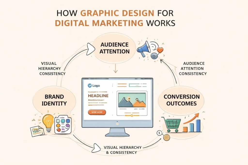
The Three Core Functions of Design in Marketing
- Attention capture – Visuals stop the scroll and create pattern interruption
- Information hierarchy – Design guides the eye to what matters most
- Brand reinforcement – Consistent visuals build recognition and trust over time
When these three align, your marketing becomes easier to consume, harder to forget, and more likely to convert.
Building a Design System That Scales
One-off graphics might look good, but they don't build equity. A design system creates consistency, speeds up production, and compounds brand recognition. This is where most service businesses falter. They treat every asset as a standalone project instead of part of a larger whole.
Your design system should include:
- Color palette (primary, secondary, neutral tones with hex codes)
- Typography hierarchy (headings, body, captions with specific weights and sizes)
- Logo usage rules (spacing, minimum sizes, approved backgrounds)
- Icon style (filled vs outlined, stroke weight, corner radius)
- Photography guidelines (tone, composition, editing style)
- Layout templates (social posts, ads, email headers, landing page sections)
Design System Benefits Comparison
| Approach | Speed | Consistency | Brand Equity | Cost Over Time |
|---|---|---|---|---|
| Ad-hoc design | Slow | Low | Scattered | High |
| Template-based | Medium | Medium | Moderate | Medium |
| Full design system | Fast | High | Compounding | Low |
A proper system turns branding from a creative guessing game into a repeatable process. You're not reinventing the wheel every time you need an ad. You're pulling from a library of pre-approved components that already work together.
The Non-Negotiable Principles
Some design rules bend. Others break your marketing. Here's what you can't ignore when creating graphic design for digital marketing in 2026.
Contrast and Readability
If your audience has to squint or guess, you've already lost. Text must be readable at a glance, on mobile, in bright sunlight, and with tired eyes at 9 PM. That means:
- Minimum 4.5:1 contrast ratio for body text (7:1 for headings)
- Font sizes at least 16px for body copy on web
- Avoid light grey text on white backgrounds
- Test designs on actual devices, not just desktop monitors
Accessibility isn't charity. It's good business. Clear contrast helps everyone read your message faster, which means more people actually consume it.
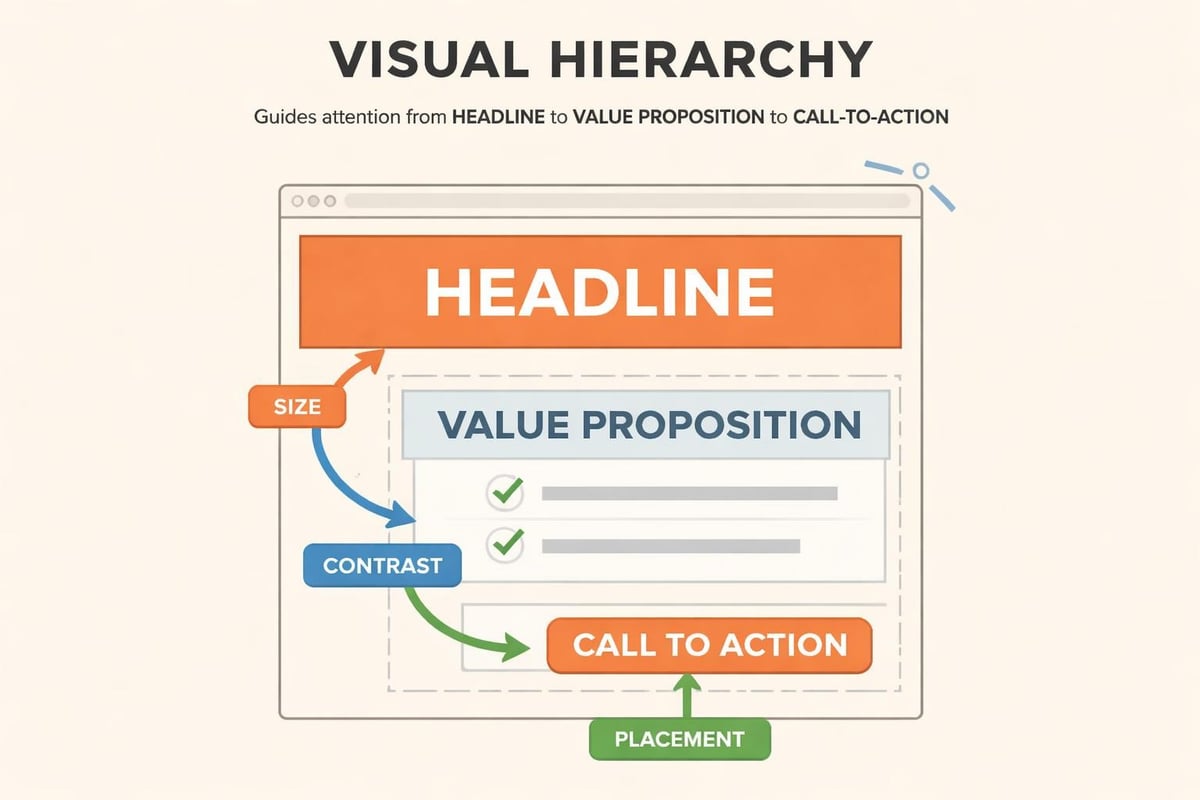
Visual Hierarchy Over Decoration
Every design should have a clear entry point and a logical flow. Your eye should move from the most important element (usually a headline or key visual) to supporting points to the call-to-action. No detours. No confusion.
Common hierarchy mistakes:
- Making everything bold (which makes nothing stand out)
- Using too many font sizes or weights
- Centering everything instead of using alignment to create structure
- Adding decorative elements that compete with the message
The importance of graphic design within digital marketing strategies lies in how visual elements guide behavior and influence decisions at an unconscious level.
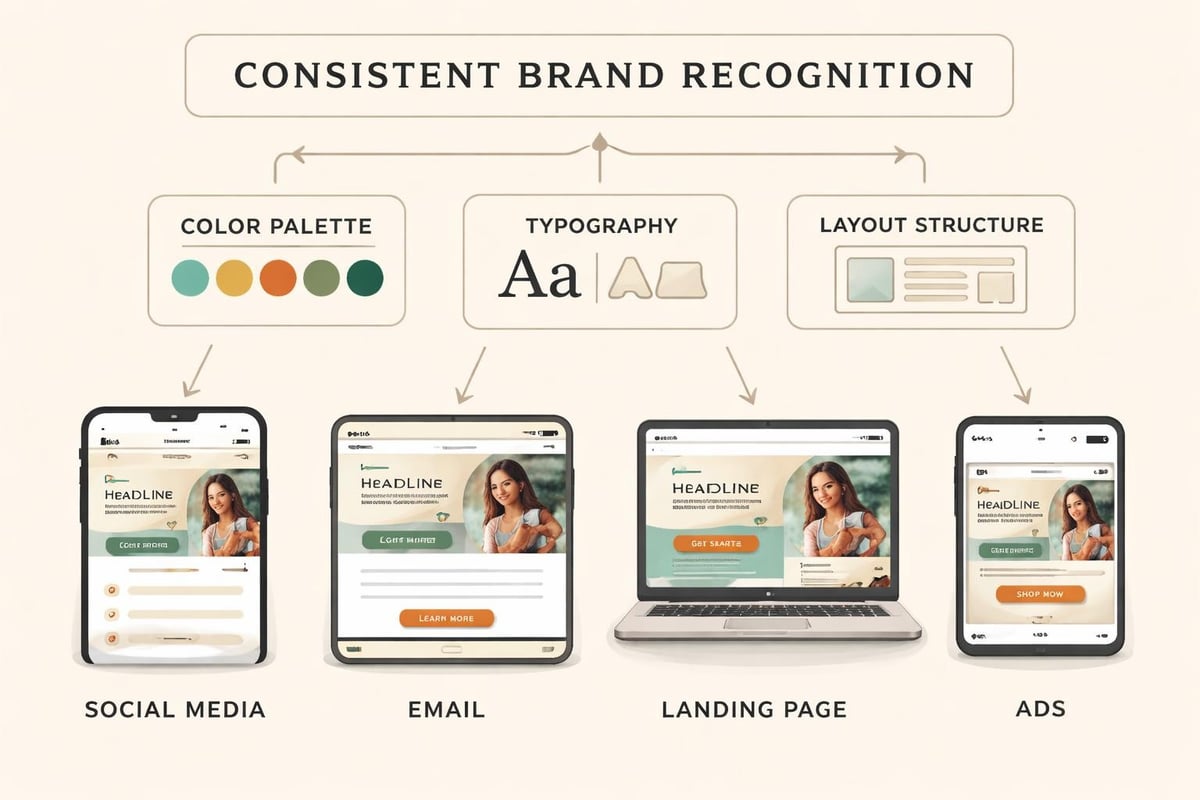
Consistency Builds Recognition
Your audience shouldn't need to verify it's you every time they see your content. Consistent use of colors, fonts, layouts, and graphic styles creates instant recognition. This matters more as attention spans shrink and feeds get noisier.
Think about brands you recognize immediately in your feed. They're not doing something wildly different each post. They're repeating a visual signature until it becomes synonymous with their name.
Platform-Specific Design Considerations
What works on Instagram won't work on LinkedIn. What converts in an email might flop as a Facebook ad. Graphic design for digital marketing requires platform thinking, not just aesthetic thinking.
Social Media Design Specs
| Platform | Feed Image | Stories | Video Thumbnail | Key Design Notes |
|---|---|---|---|---|
| 1080x1080px | 1080x1920px | 1080x1080px | High contrast, bold text, mobile-first | |
| 1200x630px | 1080x1920px | 1200x675px | Face close-ups perform, text under 20% | |
| 1200x627px | 1080x1920px | 1200x675px | Professional tone, data visuals work | |
| Twitter/X | 1200x675px | N/A | 1200x675px | Simple, scannable, meme-aware |
Dimensions matter, but so does context. LinkedIn audiences expect polish and professionalism. Instagram rewards personality and motion. Ignoring these differences wastes ad spend and dilutes brand perception.
Email Design That Actually Gets Read
Email clients are hostile to designers. Images get blocked. CSS gets stripped. Layouts break across devices. Your graphic design for digital marketing in email needs to work even when half of it doesn't load.
Best practices:
- Design for images-off mode (use ALT text strategically)
- Keep width under 600px for desktop compatibility
- Single-column layouts for mobile
- Buttons as bulletproof HTML, not just images
- Preview text and subject lines that work together
Most service businesses over-design their emails. Less is more. A clear hierarchy, one strong visual, and an obvious next step will outperform a pixel-perfect masterpiece that takes five seconds to parse.
How to Brief Designers (Or Yourself) Effectively
Bad briefs produce bad design. Even talented designers can't read minds. The gap between what you want and what you get usually comes down to how clearly you communicated the job.
Essential Brief Components
- Objective – What should this design accomplish? (Not "look good" but "drive webinar signups")
- Audience – Who sees this? What do they care about? What's their context?
- Message hierarchy – Primary message, supporting points, call-to-action (in that order)
- Brand guidelines – Link to your design system or provide color codes, fonts, logo files
- Specifications – Dimensions, file formats, platform requirements
- Examples – 2-3 references of tone or style (not to copy, but to align on direction)
- Success metrics – How will you know if this worked?
When you approach design with this level of clarity, revisions drop and output quality rises. Designers aren't guessing what you mean. They're executing against clear parameters.
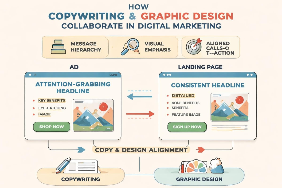
Content and Design Working Together
Your words and visuals should reinforce each other, not compete. The best graphic design for digital marketing doesn't just package content. It amplifies it.
Text-Design Integration Checklist
- Does the headline work with or without the image? (It should work standalone)
- Does the visual add information or just decoration? (Charts, diagrams, and product shots add; stock photos of smiling people rarely do)
- Can someone understand the main point in 3 seconds? (If not, simplify)
- Does the call-to-action have visual priority? (Color, size, placement should make it obvious)
This is where copywriting and design intersect. Neither works fully without the other. A brilliant headline with terrible typography gets ignored. A stunning visual with vague copy gets remembered but not acted on.
Speed Matters More Than Perfection
Service businesses don't have the luxury of three-week design cycles for every campaign. The market moves too fast. Your design process needs to balance quality with velocity.
Ways to speed up without cutting corners:
- Batch similar design tasks (all social posts at once, not one at a time)
- Create templates for recurring needs (weekly posts, event promotions, case studies)
- Use design tools with component libraries (Figma, Canva Pro with brand kits)
- Set approval deadlines to avoid endless revision loops
- Focus design effort where it matters most (landing pages and ads get more scrutiny than internal emails)
Following established graphic design rules around consistency, simplicity, and audience focus lets you move faster while maintaining quality. You're not debating fundamentals every time. You're executing within a proven framework.
Testing and Iteration
No designer gets it right on the first try every time. The difference between good marketing and great marketing is what you do after launch. Graphic design for digital marketing should be treated like any other performance asset. Test it. Measure it. Improve it.
What to Test in Design
- Color variations – Does blue outperform green for your CTA buttons?
- Image styles – Do lifestyle photos beat product shots for your audience?
- Text density – More explanation or less?
- Layout orientation – Horizontal vs vertical emphasis
- Face presence – Do images with faces increase engagement or decrease it?
Run A/B tests on ads and landing pages. Track which email designs get higher click rates. Look at session recordings to see where eyes go on your pages. This data tells you what actually works for your audience, not what design blogs say should work.
The five-step approach to mastering design for digital marketing emphasizes understanding your audience and maintaining consistency, but it also includes testing and refinement as core practices.
Common Mistakes Service Businesses Make
You don't need to be a designer to avoid these pitfalls. Awareness prevents most of them.
The Top Five Design Mistakes
- Inconsistent branding across channels – Your website looks nothing like your social presence, which looks nothing like your ads
- Overcomplicating layouts – Too many fonts, colors, elements fighting for attention
- Ignoring mobile context – Designing for desktop and hoping mobile works out
- Using poor-quality images – Pixelated logos, stretched photos, low-resolution graphics
- Forgetting white space – Cramming every pixel with content instead of letting designs breathe
Each of these erodes trust. Prospects might not articulate why they didn't convert, but inconsistent or cluttered design triggers unconscious doubt about your professionalism.
Building Internal Design Capability
Not every business needs a full-time designer on staff. But every business needs design literacy. Understanding what makes design work, how to evaluate it, and how to communicate about it improves outcomes whether you're hiring freelancers, working with agencies, or using DIY tools.
Design Skills Worth Learning (Even for Non-Designers)
- Visual hierarchy – Understanding how size, color, and position guide attention
- Typography basics – Pairing fonts, setting readable line lengths, using appropriate weights
- Color theory – Complementary colors, contrast ratios, emotional associations
- Layout grids – How structure creates consistency and speeds up design decisions
- File format knowledge – When to use PNG vs JPG vs SVG vs PDF
These aren't hard skills. A few hours with resources like AND Academy’s guide for digital marketers learning graphic design gets you competent enough to make better decisions and give better feedback.
When to Bring in Professional Help
DIY design tools have improved dramatically. But there's a ceiling. When your marketing budget reaches a certain scale, poor design becomes expensive. You're paying for traffic that bounces because your landing page looks amateur. You're running ads that don't convert because the creative doesn't match the message.
Signs you need professional design support:
- You're spending $5K+ monthly on ads but landing pages aren't converting
- Your brand feels scattered across different platforms and materials
- You're launching a new service and need market presence quickly
- Design tasks are bottlenecking your marketing execution
- You know it looks "off" but can't articulate how to fix it
Professional designers bring speed, consistency, and strategic thinking. They've solved these problems dozens of times. They know what works and why. For service businesses focused on digital growth, this expertise often pays for itself in improved conversion rates and reduced revision cycles.
Measuring Design Performance
What gets measured gets improved. Graphic design for digital marketing should have the same accountability as any other marketing investment.
Key Design Performance Indicators
| Metric | What It Measures | How to Improve It |
|---|---|---|
| Click-through rate | Ad/email design effectiveness | Test headlines, colors, CTAs |
| Bounce rate | Landing page first impression | Improve visual hierarchy, load speed |
| Time on page | Content design engagement | Better readability, visual breaks |
| Conversion rate | Overall design + message fit | Test layouts, reduce friction |
| Brand recall | Design consistency impact | Maintain visual identity |
Track these metrics before and after design changes. You'll quickly see which visual decisions actually move business outcomes versus which just look nice in your portfolio.
Strong graphic design for digital marketing isn't about following trends or winning awards. It's about building trust fast, communicating clearly, and removing friction between attention and action. When your visuals work as hard as your strategy, marketing becomes more efficient and results become more predictable. If your current design approach feels scattered or you're not seeing the conversion rates your traffic deserves, MDO Digital can help you build marketing systems that actually scale. We bring structure to the chaos and turn your brand into an asset that compounds over time.