Digital marketing design is more than making things look good. It's the strategic intersection where brand identity meets user psychology, where visual systems support business goals, and where every pixel serves a purpose. For service-based businesses, this discipline determines whether your website converts browsers into buyers, whether your emails get opened, and whether your brand creates the trust required to close high-value deals. In 2026, the gap between businesses with intentional design and those winging it has become a chasm. The good news? You don't need a massive team or endless budget. You need clarity on what digital marketing design actually does and how to deploy it systematically.
Why Digital Marketing Design Actually Matters
Most businesses treat design as decoration. They build infrastructure, then slap some colours on it and call it done. This approach wastes money and confuses customers.
Digital marketing design creates the framework for everything else to work. It's the visual language that guides someone from stranger to customer, the consistency that builds recognition, and the structure that makes complex offers feel simple.
Here's what effective design does across your marketing stack:
- Establishes immediate credibility through professional presentation
- Reduces cognitive load so prospects understand your offer faster
- Creates visual hierarchy that directs attention to conversion points
- Builds brand recognition through consistent application
- Differentiates you from competitors using generic templates
When MDO Digital audits a client's marketing, design inconsistency is one of the first red flags. Different fonts across pages. Colours that shift between platforms. CTAs that blend into backgrounds. Each inconsistency is friction, and friction kills conversion.
The Components That Build Trust
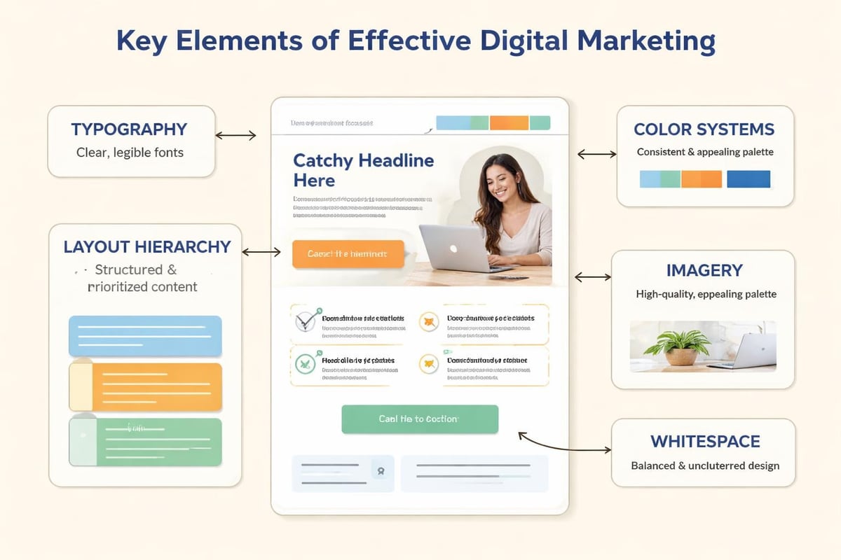
Digital marketing design isn't one thing. It's a system of interconnected components, each serving specific business functions.
| Component | Primary Function | Impact on Conversion |
|---|---|---|
| Typography | Readability, hierarchy | Keeps users reading longer |
| Color palette | Emotion, recognition | Creates brand recall |
| Layout structure | Navigation, flow | Reduces bounce rate |
| Imagery | Context, proof | Builds credibility |
| Whitespace | Focus, breathing room | Improves comprehension |
Each component needs intention behind it. Your color palette shouldn't come from "what looks nice." It should reflect your positioning. If you're a premium service, your palette communicates that. If you're the approachable alternative, same deal.
Typography does heavy lifting most businesses ignore. Typography trends for 2026 show movement toward expressive, personality-driven type, but that doesn't mean chaos. It means your font choices should reflect your brand personality while maintaining readability across devices.
Building Your Visual Identity System
A logo isn't a brand. Your brand is the complete visual and verbal system that shows up everywhere your business touches a customer.
Most service businesses operate with half a system. They have a logo, maybe some brand colours, then everyone just "wings it" when creating content. This creates inconsistency, which creates doubt.
Core Elements Every System Needs
Start with these foundational pieces:
- Primary and secondary colour palettes with specific hex codes documented
- Typography hierarchy defining H1 through body text with exact specifications
- Logo variations for different backgrounds and use cases
- Image treatment guidelines covering filters, overlays, and composition rules
- Icon style defining whether you use line, filled, or illustrated icons
This isn't busywork. It's infrastructure. With these defined, anyone on your team (or any contractor you hire) can create on-brand materials without constant oversight.
Logo design trends for 2026 emphasize flexibility and expressiveness. Your logo might need to adapt to different contexts, but those adaptations should follow rules, not impulses.
The brands winning in 2026 have documented systems. They have Figma files or brand books that show exactly how elements combine. This documentation is particularly critical if you're running digital marketing across multiple platforms because each platform has different technical requirements but needs consistent brand expression.
Designing for Conversion, Not Decoration
Here's where most digital marketing design goes wrong. Businesses optimize for "looks professional" instead of "drives the desired action."
Every design decision should connect to a business outcome. Beautiful work that doesn't convert is expensive art, not marketing.
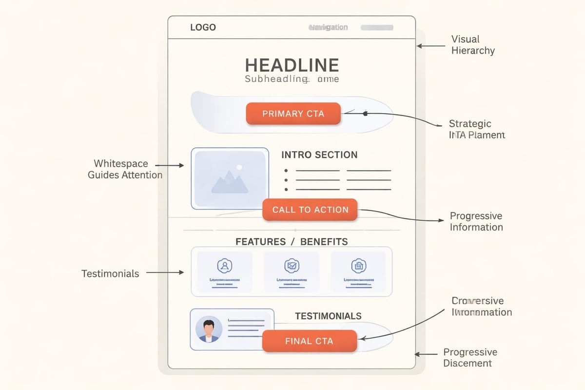
The Conversion-Focused Design Framework
Start with the goal. Before touching design tools, know what you want the user to do. Book a call? Download a lead magnet? Watch a demo? The goal shapes everything.
Create visual hierarchy that supports the goal. Your most important element should be the most visually prominent. Sounds obvious, yet most websites bury their primary CTA behind three paragraphs of copy and use the same visual weight for everything.
Reduce options ruthlessly. Every additional element, link, or choice reduces the likelihood of the primary action happening. Best practices for graphic design in digital marketing emphasize purposeful design where each element earns its place.
Consider this comparison:
| Design Approach | Elements on Page | Primary CTA Placement | Conversion Rate |
|---|---|---|---|
| Traditional | 15+ links, multiple CTAs | Below fold | 1.2% |
| Conversion-focused | 3-5 links, single CTA | Above fold, repeated | 4.7% |
| Optimized | Minimal navigation, progressive disclosure | Multiple strategic positions | 7.3% |
The numbers don't lie. Simplicity converts.
This doesn't mean boring. It means intentional. Your website design can have personality and punch while still maintaining laser focus on the outcome that matters.
Platform-Specific Design Considerations
Digital marketing design isn't one-size-fits-all. What works on your website fails on Instagram. What converts in email looks broken on TikTok.
Each platform has technical constraints and user expectations. Ignoring these creates friction.
Website Design Priorities
Your website is your owned platform. It deserves the most sophisticated design implementation.
Speed matters more than decoration. Landing page design trends emphasize speed-first approaches because every second of load time costs you visitors. Heavy animations, unoptimized images, and bloated code kill conversion before design quality even matters.
Mobile-first isn't optional. Over 60% of business research happens on mobile devices. If your design doesn't work perfectly on a phone, you're losing the majority of your potential customers.
Structure content for scanning, not reading. Use short paragraphs, clear subheadings, and bullet points. Long blocks of text might work in whitepapers, but they fail on screens.
Social Media Design Parameters
Each platform has optimal dimensions, but that's just the start. Each also has cultural norms around design style.
LinkedIn responds to professional, clean design with data visualization and clear value propositions. Instagram wants bold, thumb-stopping visuals with personality. Twitter (or whatever it's called this week) needs information density packaged attractively.
The mistake is creating one design and forcing it everywhere. The smart play is creating a flexible visual system that adapts to platform requirements while maintaining brand recognition.
Email Design That Actually Gets Read
Email design faces unique constraints. Many clients still block images by default. Responsive design is critical. And you're competing with 100 other messages in the inbox.
Subject line and preview text are design elements too. They need as much attention as your visual layout.
Keep layouts simple. Single column, clear hierarchy, one primary CTA. Fancy multi-column layouts break in half the email clients out there.
Design for dark mode. More users enable dark mode every year. Your carefully chosen white background might render as blinding in their inbox.
The Role of User Experience in Design
Digital marketing design and user experience aren't separate disciplines. They're different perspectives on the same work.
UX focuses on how things work. Design focuses on how they look and feel. Both matter equally.
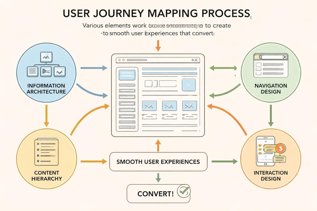
Information Architecture as Design
How you structure information is a design decision with massive impact. User experience best practices emphasize effective navigation and information architecture as foundational to adoption and conversion.
Your navigation should answer "what can I do here?" in three seconds. Your content should flow logically from problem to solution. Your forms should only ask for information you actually need.
Map user journeys before designing screens. Understand what questions someone has at each stage. Then design to answer those questions visually and verbally.
Accessibility Is Good Design
Accessible design isn't a separate concern. It's better design for everyone.
- Sufficient color contrast helps everyone read more easily, not just visually impaired users
- Clear hierarchy helps everyone understand content faster, not just screen reader users
- Keyboard navigation helps everyone move efficiently, not just users with mobility limitations
The WCAG guidelines aren't restrictions. They're standards that push your work toward clarity and usability.
When you design for branding and accessibility together, you create materials that work for the widest audience while maintaining strong brand expression.
Implementing Design Systems at Scale
Having a design system documented is step one. Actually using it consistently is where most businesses fall apart.
You need process and tools, not just guidelines.
Tools That Enforce Consistency
Design tools like Figma or Adobe XD let you create component libraries. Build your buttons, cards, forms, and layouts once, then reuse them. When you update the master component, every instance updates.
Brand asset management keeps everyone using current logos, images, and templates. Dropbox folders don't cut it. You need searchable, version-controlled systems.
Style guides and documentation should be accessible to everyone who creates content. If your team can't find the guidelines, they'll guess. Guessing creates inconsistency.
For agencies and larger teams, tools like Frontify or Brandfolder centralize everything. For smaller operations, a well-organized Notion database with clear naming conventions works fine.
Training Your Team
Your design system only works if people understand why it exists and how to use it.
Create simple documentation with examples. Show the right way and the wrong way. Explain the thinking behind decisions, not just the rules.
Regular review catches drift before it becomes a problem. Monthly or quarterly audits of marketing materials reveal where consistency breaks down. Address those gaps with better tools or clearer guidelines.
Balancing Trends and Timelessness
Canva’s 2026 design trends point toward authenticity and imperfection. Digital marketing design trends emphasize AI-driven personalization and bold aesthetics.
Trends offer inspiration, not instruction.
When to Follow Trends
Adopt trends that solve business problems or align with your brand positioning. If brutalist design matches your "no-BS" brand personality, explore it. If maximalist colour palettes help you stand out in a sea of minimalist competitors, test them.
Ignore trends that conflict with your brand or user needs. Your professional services firm probably shouldn't adopt chaotic, experimental layouts just because they're trending. Your e-commerce site shouldn't sacrifice usability for aesthetic experimentation.
Trend adoption timeline matters. Being first to a trend gets attention but risks looking dated quickly. Being last looks derivative. The sweet spot is early enough to feel current, late enough that the trend has proven effectiveness.
Building Timeless Foundations
Your core visual identity should outlast trends. Logo, primary colors, typography system. These elements should work for years, not months.
Trend expression happens in execution, not foundation. Your social media graphics can experiment with current aesthetic movements while your website maintains cleaner, more enduring design.
This approach gives you flexibility. You can refresh campaigns and content without rebuilding your entire brand identity every time design trends shift.
Measuring Design Performance
You can't improve what you don't measure. Digital marketing design needs performance metrics, not just aesthetic opinions.
Metrics That Matter
Conversion rate is the primary metric. Whatever action you designed for, are people taking it?
Time on page indicates engagement. If people bounce immediately, your design failed to communicate value or relevance.
Scroll depth shows whether your layout guides users through content or loses them.
Click maps and heat maps reveal what people actually interact with versus what you intended them to notice.
A/B testing removes guesswork. Test button colors, headline sizes, image choices, layout variations. Let data guide decisions.
The Feedback Loop
Design, measure, learn, iterate. This cycle never stops.
Most businesses design once, launch, then forget about it. Winners treat design as ongoing optimization. They review analytics monthly. They run quarterly design sprints to address weak points. They stay ahead of performance degradation.
Marketing and web development work best as integrated, continuous processes. Design isn't a project with an end date. It's infrastructure that evolves with your business.
Avoiding Common Digital Marketing Design Mistakes
Even experienced businesses make predictable mistakes. Knowing them helps you avoid expensive learning curves.
Mistake one: Designing without strategy. Pretty doesn't pay bills. Every design decision needs strategic justification connected to business goals.
Mistake two: Inconsistency across touchpoints. Your Instagram, website, and email should feel like they come from the same business. Inconsistency suggests instability or lack of professionalism.
Mistake three: Following personal preferences instead of user needs. What you like doesn't matter. What works for your target customer matters.
Mistake four: Ignoring performance data. If your beautiful design converts at 0.5%, it's failing. Ego doesn't close deals.
Mistake five: Underinvesting in mobile optimization. Mobile isn't a secondary consideration. It's often the primary experience your prospects have with your brand.
The Shift Toward Vibe Marketing and Aesthetic Intuition
The rise of vibe marketing represents a fascinating shift. As AI handles more execution, the strategic and aesthetic decisions become more valuable.
This doesn't mean abandoning data. It means recognizing that emotional resonance and aesthetic coherence drive decisions in ways spreadsheets can't fully capture.
For service-based businesses, this shift is particularly relevant. Your prospects aren't buying features. They're buying confidence, transformation, relief from pain. Digital marketing design communicates those intangibles through visual language that creates feeling before rational evaluation.
The businesses winning in 2026 blend data-driven optimization with aesthetic intuition. They test rigorously but lead with vision. They measure everything but recognize that some value defies measurement.
This balance is where digital marketing design becomes strategic advantage, not commodity service. Anyone can hire a designer. Not everyone can build a visual system that compounds trust and recognition over time.
Integration With Broader Marketing Systems
Digital marketing design doesn't exist in isolation. It's one component of your complete marketing system.
Your CRM needs design. Email sequences need design. Proposal templates need design. Every touchpoint is a design opportunity.
When these pieces share visual language and strategic intention, they multiply each other's effectiveness. A prospect sees your ad, visits your website, receives your email, reviews your proposal. If those experiences feel cohesive, trust builds. If they feel disjointed, doubt creeps in.
This integration requires central coordination. Someone needs to own visual consistency across your entire marketing stack. For smaller businesses, this might be you working from documented guidelines. For larger operations, it's a brand manager or creative director ensuring alignment.
The point is intentionality. Every piece of content, every customer touchpoint, every visual element should reinforce your positioning and move prospects toward conversion. Random acts of design don't compound. Systematic design does.
Digital marketing design is infrastructure, not decoration. It's the visual and experiential framework that turns attention into trust and trust into revenue. The businesses that treat it strategically, measure it rigorously, and execute it consistently create compounding advantages that generic approaches can't touch. If you're ready to build marketing systems that convert chaos into predictable growth, MDO Digital specializes in exactly this work: high-trust websites, integrated automation, and design that serves business outcomes, not just aesthetic preferences.