Design for marketing isn't about making things look pretty. It's about building trust at scale, guiding decisions, and creating systems that turn attention into predictable revenue. When your design works properly, prospects understand what you do, believe you can help them, and know exactly what to do next. When it doesn't, you're bleeding leads and leaving money on the table. For service businesses trying to scale with clarity, design for marketing is the infrastructure that makes everything else work.
Why Design for Marketing Matters More Than You Think
Most business owners treat design as decoration. They hire someone to "make it look good" and hope that translates to results. That's backwards.
Design for marketing is a system. It organizes information, establishes hierarchy, builds credibility, and removes friction from the buyer's journey. Every visual decision either moves someone closer to conversion or pushes them away.
Here's what actually happens when design works:
- Prospects understand your offer in seconds, not minutes
- Trust builds before they read a single word
- Calls to action feel natural, not pushy
- Your brand looks consistent across every touchpoint
- Leads flow into your CRM without manual intervention
The businesses that scale predictably don't just have better design. They have design that serves a marketing function at every level. From website structure to email templates to sales collateral, everything works together as part of one system.
The Real Cost of Bad Design
Bad design doesn't just look unprofessional. It destroys conversion rates, confuses your audience, and makes every marketing dollar work harder for less return.
When your website loads slowly, prospects leave. When your email looks broken on mobile, it goes to trash. When your landing page buries the value proposition under generic stock photos, people bounce. These aren't aesthetic problems. They're revenue problems.
A confused prospect doesn't convert. They don't even remember you existed. HubSpot’s design principles emphasize clarity and purpose, which directly impact whether someone trusts you enough to take the next step.
Core Elements of Effective Design for Marketing
Design for marketing breaks down into systems you can measure, test, and improve. Here's what matters.
Visual Hierarchy and Information Architecture
People don't read marketing materials. They scan them. Your job is to make scanning easy and profitable.
Visual hierarchy controls what people notice first, second, and third. It uses size, contrast, spacing, and positioning to guide attention exactly where you need it. When Adobe discusses design for common marketing projects, they emphasize this principle because it determines whether your message lands or gets ignored.
Strong hierarchy means:
- Headlines grab attention immediately
- Subheadings create clear section breaks
- Body copy is readable without effort
- Calls to action stand out visually
- White space gives content room to breathe
Poor hierarchy makes everything compete for attention at once. Nothing wins. The prospect gives up and leaves.
| Element | Purpose | Design Treatment |
|---|---|---|
| Headline | Hook attention, communicate value | Large, bold, high contrast |
| Subheading | Expand on promise, add context | Medium weight, clear spacing |
| Body Copy | Explain, educate, persuade | Readable size, generous line height |
| CTA Button | Drive action | High contrast color, clear label, whitespace |
| Supporting Images | Build trust, demonstrate proof | Relevant, high quality, purposeful |
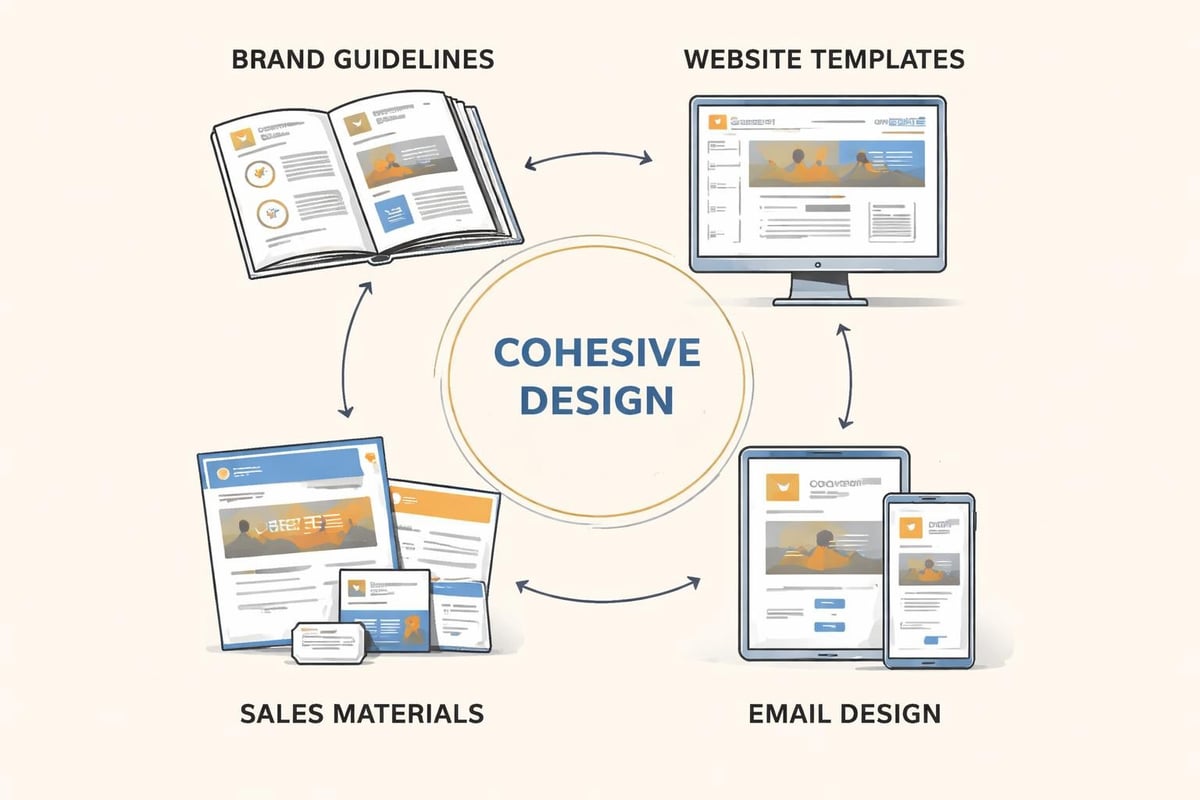
Brand Consistency Across Channels
Your brand isn't your logo. It's the accumulated impression someone builds after every interaction with your business.
Design for marketing maintains that impression deliberately. Colors, fonts, tone, image style, and layout patterns should feel consistent whether someone sees your website, opens your email, or downloads a PDF.
Consistency builds recognition. Recognition builds trust. Trust converts. When your branding and design systems align, prospects don't waste mental energy wondering if they're dealing with the same company. They focus on your offer instead.
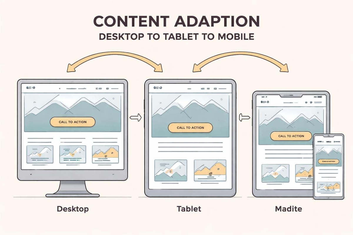
Mobile First Design Reality
More than half your traffic comes from mobile devices. If your design for marketing ignores this, you're ignoring most of your audience.
Mobile first doesn't mean mobile only. It means designing for the smallest, most constrained experience first, then expanding for larger screens. This forces you to prioritize what actually matters.
Salesforce’s email design best practices emphasize mobile optimization because email open rates on phones dominate desktop. The same principle applies to websites, landing pages, and any digital marketing asset.
Mobile design requirements:
- Readable text without zooming (minimum 16px)
- Touch targets at least 44×44 pixels
- Single column layouts that don't require horizontal scrolling
- Fast load times under 3 seconds
- Clear, accessible navigation
Building Trust Through Design Choices
Design communicates competence before someone reads a word. Your visual presentation tells prospects whether you're professional, whether you understand their world, and whether you're worth their time.
Professional Photography vs Stock Images
Generic stock photos destroy credibility. They signal that you took the easy route, that you're not showing your real work, or worse, that you don't have real work to show.
Professional photography, screenshots of actual results, and real client examples build trust. They prove you do what you say you do. They give prospects something concrete to evaluate.
If you must use stock imagery, make it relevant and specific. Avoid the smiling business people in a conference room. Choose images that illustrate concepts or support your message without pretending to be something they're not.
Typography That Supports Reading
Typography choices affect readability, which affects how much of your message actually gets consumed. Poor font choices make reading harder. Harder reading means less engagement. Less engagement means fewer conversions.
Typography fundamentals for design for marketing:
- Use no more than 2-3 font families per project
- Maintain at least 1.5 line height for body copy
- Keep line length between 50-75 characters for comfortable reading
- Use sufficient contrast (minimum 4.5:1 ratio for body text)
- Choose fonts designed for screen reading
Fancy display fonts work for headlines. Readable, clear fonts work for everything else. Don't sacrifice clarity for style.
Color Psychology and Conversion
Colors trigger emotional responses and influence behavior. They're not just decoration in effective design for marketing.
Red creates urgency. Blue builds trust. Green suggests growth or approval. Orange drives action. These aren't universal rules, but they're patterns backed by testing across millions of interactions.
More important than choosing the "right" color is using color strategically. Your primary brand color establishes identity. Your accent colors guide attention. Your call to action color needs enough contrast to stand out without clashing.
| Color | Common Association | Marketing Use Case |
|---|---|---|
| Blue | Trust, stability, professionalism | Financial services, B2B, healthcare |
| Green | Growth, health, approval | Environmental, wellness, finance |
| Orange | Energy, enthusiasm, action | CTAs, limited offers, creative services |
| Purple | Luxury, creativity, wisdom | Premium brands, beauty, education |
| Red | Urgency, excitement, passion | Sales, clearance, food, alerts |
Design for Marketing in Different Channels
Each marketing channel has different design requirements. What works for email fails on social media. Landing page design differs from website design. Understanding these distinctions improves results across the board.
Website Design That Converts
Your website is your most important marketing asset. It's where prospects evaluate whether you're legitimate, whether you understand their problem, and whether they want to work with you.
Design for marketing on websites means optimizing for conversion paths. Every page should have a clear purpose and a next step. Navigation should be intuitive. Forms should be simple. Load times should be fast.
Shopify’s marketing design guide emphasizes creating clear pathways that guide visitors toward desired actions. This isn't about manipulation. It's about removing confusion and making it easy for interested prospects to move forward.
Key website design elements:
- Clear value proposition above the fold
- Social proof positioned near conversion points
- Minimal navigation options to reduce decision fatigue
- Fast load times (under 3 seconds)
- Accessible contact information throughout
Email Design That Gets Read
Email design balances information density with scannability. You're working within a smaller canvas, often on mobile devices, competing with dozens of other messages.
Effective design for marketing in email means using hierarchy aggressively. One main message. One clear call to action. Minimal distractions. The email design best practices from Salesforce reinforce this approach because it works.
Use preview text strategically. Make your subject line and sender name recognizable. Design for dark mode. Test across email clients. These details matter because email is still one of the highest ROI channels available.
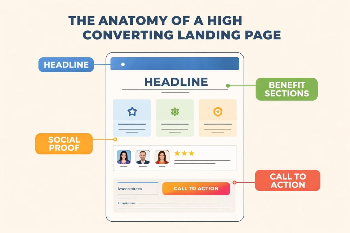
Landing Pages Built to Convert
Landing pages have one job: convert visitors into leads or customers. Every design decision should serve that goal.
Remove navigation. Eliminate exit points. Focus attention on the offer and the action you want someone to take. Use directional cues, visual hierarchy, and strategic spacing to guide the eye down the page toward conversion.
Strong landing page design for marketing includes:
- Compelling headline that matches the source traffic
- Benefit focused subheadings that expand the promise
- Social proof positioned strategically throughout
- Clear, contrasting call to action buttons
- Minimal form fields (only ask what you need)
Testing and Improving Your Design for Marketing
Design isn't done when you launch. It's done when you stop testing. The businesses that scale predictably treat design as a system that improves over time through measurement and iteration.
What to Test and How
A/B testing reveals what actually works versus what you think works. Test one variable at a time. Run tests long enough to reach statistical significance. Make decisions based on data, not opinions.
High impact elements to test:
- Headline variations and value propositions
- Call to action button text and color
- Form length and field requirements
- Image placement and style
- Layout and visual hierarchy changes
Small improvements compound. A 5% lift in conversion rate across five different elements creates meaningful revenue growth over time. This is how marketing systems and growth infrastructure create predictable results.
Design Systems That Scale
As your business grows, maintaining consistency gets harder. Design systems solve this by creating reusable components, clear guidelines, and documented standards.
A proper design system includes:
- Brand guidelines (colors, fonts, logo usage)
- Component library (buttons, forms, cards)
- Layout templates for common page types
- Image style guidelines and requirements
- Voice and tone documentation
This isn't bureaucracy. It's efficiency. When your team can assemble new marketing assets from proven components, you ship faster and maintain quality. When everything looks professional and consistent, trust builds faster.
Measuring Design Impact
Good design for marketing shows up in your metrics. Track the numbers that matter:
| Metric | What It Measures | Target Range |
|---|---|---|
| Bounce Rate | First impression quality | Under 50% |
| Time on Page | Content engagement | 2+ minutes for key pages |
| Conversion Rate | Design effectiveness | 2-5% for cold traffic |
| Form Completion | Friction level | Above 60% |
| Mobile Performance | Mobile optimization | Load under 3 seconds |
If these numbers aren't improving, your design isn't working. Treat it as a system that needs adjustment, not a finished product.
Common Design for Marketing Mistakes
Even experienced businesses make predictable mistakes that kill conversions. Here's what to avoid.
Over Designing and Under Communicating
Fancy animations, complex layouts, and creative navigation might win design awards. They rarely win customers.
Your prospects don't care how clever your design is. They care whether you can solve their problem. Prioritize clarity over creativity. Make the message obvious. Make the next step clear.
Ignoring Load Speed
Beautiful design that takes 10 seconds to load isn't beautiful. It's broken. Every second of delay kills conversions.
Optimize images. Minimize code. Use proper hosting. Cache aggressively. Monitor performance continuously. Speed is a competitive advantage that most businesses ignore.
Not Designing for Accessibility
Accessible design isn't charity. It's good business. When your design works for people with disabilities, it works better for everyone.
Use sufficient color contrast. Add alt text to images. Ensure keyboard navigation works. Design readable, hierarchical content. These practices expand your audience and improve your marketing effectiveness across the board.
Following Trends Instead of Testing
Design trends come and go. What matters is what converts for your specific audience with your specific offer.
Test before you redesign. Understand why something isn't working before you change it. Build on proven foundations rather than chasing what looks current.
Building Your Design for Marketing System
You don't need a massive budget or a huge team to implement effective design for marketing. You need clear systems, consistent execution, and a willingness to improve based on what the data tells you.
Start with your website. Make sure it loads fast, communicates clearly, and guides visitors toward conversion. Extend those principles to email, landing pages, and every other marketing touchpoint.
Document your decisions. Create templates. Build reusable components. Make it easy to maintain quality as you scale.
Design for marketing isn't a project. It's infrastructure that compounds in value over time, just like marketing systems and automation that turn attention into predictable demand.
Design for marketing creates the foundation for everything else you do. When your visual systems build trust, guide attention, and remove friction, your marketing works harder and your growth becomes predictable. If you need help building marketing infrastructure that actually scales, MDO Digital specializes in creating high trust websites, CRM systems, and data driven marketing for service businesses. We remove chaos, protect leads, and build structured growth that compounds over time.