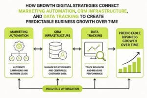
Most service businesses treat design and marketing as separate departments. One team worries about how things look, another worries about whether they work. This split creates friction, wasted budget, and campaigns that look polished but convert poorly. When you design digital marketing as a unified system, everything changes. Your website, emails, ads, and automation start working together instead of competing for attention. The result is clarity for your audience and predictable growth for your business.
What It Means to Design Digital Marketing
To design digital marketing properly means building every touchpoint with both form and function in mind. It's not about making things pretty, it's about creating experiences that guide people from curiosity to conversion without confusion.
This approach requires three elements working together:
- Visual consistency that builds recognition and trust across channels
- Structural clarity that removes friction from the buyer journey
- Data integration that connects design decisions to measurable outcomes
When a prospect sees your Google ad, clicks through to your landing page, and receives a follow-up email, they should experience one coherent story. Not three different visual languages fighting for credibility.
The Cost of Disconnected Design
Service businesses lose leads in the gaps between systems. Someone clicks an ad optimized for conversions but lands on a homepage designed for brand awareness. The messaging doesn't match. The call to action is buried. The lead closes the tab.
Or they fill out a form, but the CRM doesn't trigger the right follow-up sequence because nobody designed the handoff between marketing and sales. These aren't technical problems, they're design problems. You can't automate trust. You have to design for it.
Building Visual Systems That Scale
Brand guidelines gather dust because they're not built for the channels where your marketing actually lives. A logo and color palette won't help your team design an email campaign or configure a landing page without breaking consistency.
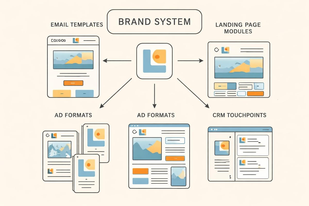
Creating Modular Design Components
Smart businesses build libraries of reusable design elements that maintain consistency while allowing flexibility. Instead of designing each campaign from scratch, you're assembling proven components in new configurations.
Your design system should include:
- Email header and footer templates with variable content blocks
- Landing page sections (hero, benefits, testimonials, forms) that snap together
- Ad templates sized for each platform with locked brand elements
- CRM email signatures and document templates for sales follow-up
- Social media post formats that maintain visual identity
This modular approach doesn't limit creativity. It protects consistency while speeding up execution. Your team spends less time debating font choices and more time optimizing conversion paths. According to best practices for graphic design in digital marketing, purposeful design and visual hierarchy significantly enhance engagement across channels.
Mobile-First Design Isn't Optional
Most traffic comes from phones. Most conversions happen on desktop. This creates a design problem that many businesses solve poorly by building for desktop and hoping mobile doesn't break too badly.
When you design digital marketing mobile-first, you start with the most constrained screen and work up. This forces clarity. You can't hide weak messaging in whitespace or bury calls to action below the fold when you only have 375 pixels of width.
| Design Element | Mobile Consideration | Impact on Conversion |
|---|---|---|
| Navigation | Simplified menu, priority CTAs visible | 34% higher engagement |
| Forms | Single column, minimal fields, large touch targets | 42% completion increase |
| Content | Scannable chunks, bold subheads, bullet lists | 28% lower bounce rate |
| CTAs | Fixed position or repeated, thumb-friendly size | 51% more clicks |
These improvements compound. Better mobile experience means lower acquisition costs, higher quality leads, and easier sales conversations. The importance of accessibility in digital marketing extends beyond compliance to creating inclusive experiences that convert better for everyone.
Designing Email Marketing That Drives Action
Email remains the highest ROI channel for most service businesses, but poor design kills performance. When someone opens your email on a phone while walking, you have about three seconds to communicate value.
Structure Before Style
Beautiful emails that don't convert are expensive art projects. Start with structure:
- Subject line that creates curiosity or urgency without deception
- Preheader text that extends the subject line promise
- Opening line that acknowledges context or references previous interaction
- Single clear offer with supporting benefits
- One primary CTA repeated twice (above and below fold)
- Mobile-optimized layout with single column content
- Clear sender identity with consistent from name and reply address
The design supports this structure. Hierarchy guides attention. Whitespace creates breathing room. Color draws eyes to the action you want people to take. Following email marketing best practices around mobile-first design and accessibility ensures your messages perform across devices and audiences.
Automated Sequences Need Design Too
Most businesses design their promotional emails carefully but let automated sequences run with plain text or default templates. This is backwards. Your automated welcome series, abandoned cart sequence, and nurture campaigns talk to people when they're most engaged. They deserve better design than your monthly newsletter.
Each automated email should feel personal while maintaining brand consistency. Variable content blocks let you customize without creating chaos. Dynamic images can reflect the specific service or product someone showed interest in while keeping the overall layout familiar.
Landing Pages That Convert Attention to Leads
When you design digital marketing campaigns, every click costs money. Landing pages are where that investment either compounds or evaporates.
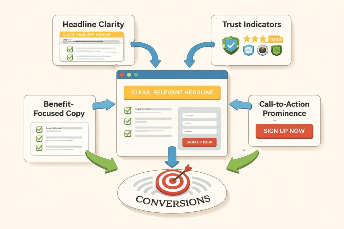
The Five-Second Test
Someone clicking your ad already made one micro-decision in your favor. They have limited patience for confusion. Your landing page needs to answer three questions in five seconds:
- Am I in the right place? (Does this match what I clicked?)
- What's in it for me? (Why should I care right now?)
- What do I do next? (Is the action clear and low-risk?)
Design solves this through hierarchy and clarity. Your headline should connect directly to ad copy. Benefits should be scannable. The form should ask for exactly what you need and nothing more.
Form Design That Respects Time
Long forms kill conversions. But sometimes you need more than name and email to qualify leads properly. The solution isn't shortening the form, it's designing the experience around perceived effort.
Techniques that reduce form friction:
- Multi-step forms with progress indicators
- Conditional logic that shows only relevant fields
- Inline validation that confirms correct input immediately
- Smart defaults based on previous selections
- Saved progress for longer applications
| Form Length | Completion Rate | Lead Quality | Best Use Case |
|---|---|---|---|
| 2-3 fields | 68% | Low to Medium | Newsletter, content downloads |
| 4-7 fields | 42% | Medium to High | Consultation requests, demos |
| 8+ fields | 23% | High | Complex services, qualified RFPs |
Choose form length based on your sales process, not arbitrary conversion rate targets. A 70% conversion rate on unqualified leads wastes more time than a 25% rate on ready buyers. The key is making the effort feel proportional to the value offered.
Advertising Design That Stops Scrolls
Paid advertising rewards clarity and pattern interruption. You're competing with everything else in someone's feed. Generic stock photos and clever wordplay don't cut through.
Testing Creative Systematically
The scientific method applies to ad design. Change one variable at a time. Let data decide winners. Scale what works.
- Start with 3-4 creative variations testing one element (image, headline, offer, format)
- Run until statistical significance (usually 50-100 conversions per variant)
- Kill losers, keep winner, introduce new challenger testing different element
- Document learnings in a creative brief for next campaign
- Repeat monthly to prevent creative fatigue
This systematic approach builds institutional knowledge. You learn what resonates with your specific audience instead of following generic best practices. Your advertising strategies improve because they're based on evidence, not assumptions.
Platform-Specific Design Considerations
Each platform has its own visual language and user behavior. LinkedIn users expect different design than Instagram users. What works on Facebook often fails on Google Display Network.
Platform design priorities:
- LinkedIn: Professional imagery, data-driven headlines, B2B credibility markers
- Facebook/Instagram: Pattern interruption, emotional connection, social proof
- Google Search: Headline relevance, benefit clarity, urgency signals
- Google Display: Visual simplicity, brand recognition, clear CTA
- YouTube: First three seconds hook, visual storytelling, sound-optional design
When you design digital marketing across platforms, consistency matters less than context. Your brand should be recognizable, but the creative execution should respect where people are and what they expect. Resources like digital ads best practices can guide platform-specific optimization strategies.
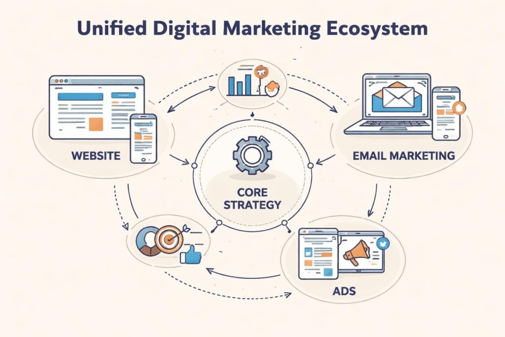
Website Design as Marketing Infrastructure
Your website isn't a brochure, it's the hub where all other marketing channels connect. When you design digital marketing holistically, the website becomes infrastructure that supports campaigns instead of a static destination that competes with them.
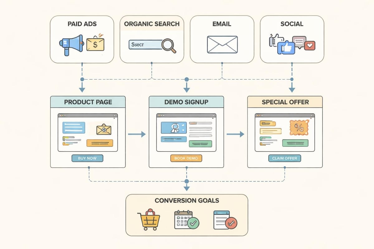
Dynamic Content for Different Sources
Someone visiting from a Google ad about CRM automation has different context than someone clicking an email about branding services. Showing them identical homepage content wastes the awareness you've already built.
Smart websites adapt content based on source:
- Paid traffic sees landing pages that match ad messaging and remove navigation distractions
- Email subscribers see personalized welcome messages and topic-specific CTAs
- Organic search visitors get content that extends the topic they searched for
- Retargeting audiences see messages acknowledging previous interactions
This isn't complex personalization requiring enterprise software. Simple URL parameters and conditional content blocks can create meaningful context matching that improves conversion rates by 30-40%.
Trust Signals in the Right Places
Case studies and testimonials matter, but their placement determines effectiveness. Sprinkling social proof randomly across pages doesn't build trust strategically.
Place trust indicators where doubt naturally occurs:
- Above pricing discussions: Show ROI proof from similar clients
- Near form submissions: Display security badges and privacy commitments
- On high-exit pages: Add case studies relevant to that service
- In checkout flows: Reinforce guarantees and support availability
The case studies from successful campaigns demonstrate how strategic placement of trust elements can significantly improve conversion rates without changing core offerings.
Measuring Design Performance
You can't improve what you don't measure. When you design digital marketing with analytics built in from the start, every campaign becomes a learning opportunity.
Metrics That Actually Matter
Vanity metrics feel good but don't compound. Focus on measurements that connect design decisions to business outcomes:
| Metric Category | What to Track | Why It Matters |
|---|---|---|
| Engagement | Time on page, scroll depth, video completion | Shows if design holds attention |
| Conversion | Form starts vs completions, CTA click rate | Reveals friction points |
| Revenue | Cost per lead, customer acquisition cost, LTV | Connects design to profit |
| Technical | Page speed, mobile usability, error rates | Identifies invisible blockers |
Set up custom events that track micro-conversions. Someone downloading a resource, watching 50% of a video, or visiting your pricing page three times is signaling intent. These behaviors should trigger both measurement and marketing automation.
A/B Testing Design Elements
Test big changes first. Swapping button colors rarely moves needles. Testing different value propositions, offer structures, or form layouts can double conversion rates.
High-impact elements to test:
- Headline variations that emphasize different benefits
- Long-form vs short-form landing pages
- Video vs static hero sections
- Social proof placement and format
- Risk reversal statements and guarantees
Run tests long enough to account for day-of-week and time-of-day variations. A winner on Tuesday might lose on Friday when different decision-makers are reviewing options.
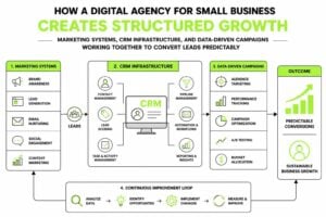
Integrating Design With Marketing Systems
Design doesn't end when someone converts. The handoff from marketing to sales needs as much design thinking as your landing pages. Following principles from UX design for effective digital marketing ensures the entire customer journey maintains consistency and reduces friction.
CRM as Design Challenge
Most CRMs are ugly, confusing, and filled with fields nobody uses. This isn't just an internal problem. Poor CRM design creates poor customer experiences.
When your sales team can't quickly find context about a lead's journey, conversations start from scratch. When automated emails pull from messy data fields, personalization breaks. When pipeline stages don't match actual buyer behavior, forecasting fails.
Designing your CRM means:
- Creating deal stages that reflect how people actually buy
- Building custom fields that capture useful context without overwhelming forms
- Designing email templates that feel personal at scale
- Setting up automation that responds to behavior, not arbitrary timelines
- Connecting website activity to CRM records for full visibility
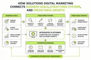
This systems-level thinking separates businesses that design digital marketing strategically from those cobbling together tactics. Our approach to marketing systems emphasizes this integration as fundamental infrastructure, not optional enhancement.
Content Design for Full Funnel
Your design system should extend through the entire customer journey. Someone who's never heard of you needs different content design than someone evaluating three vendors.
Design considerations by funnel stage:
- Awareness: Pattern interruption, emotional resonance, problem agitation
- Consideration: Structured information, comparison tools, educational depth
- Decision: Risk reversal, specificity, urgency without pressure
- Retention: Personalization, progress tracking, expansion opportunities
Each stage needs its own design approach while maintaining brand consistency. The visual language stays familiar, but the information architecture and calls to action shift based on where someone is in their journey.
When you design digital marketing as interconnected systems rather than isolated campaigns, everything compounds. Your website, emails, ads, and automation reinforce each other instead of creating friction. Leads move smoothly from awareness to decision because you've designed clear paths instead of hoping they figure it out. This systematic approach is what MDO Digital builds for service businesses: high-trust design, integrated marketing infrastructure, and data-driven systems that turn attention into predictable demand. If you're ready to remove chaos and build growth that compounds, we should talk.