Design for digital marketing isn't about making things look pretty. It's about creating systems that guide attention, build trust, and turn casual browsers into paying clients. For service-based businesses trying to scale, design becomes the infrastructure that makes every marketing dollar work harder. It's the difference between a website that generates leads on autopilot and one that just sits there looking professional while your competitors collect the business. Most companies treat design as decoration. The ones that grow treat it as architecture.
Why Design for Digital Marketing Matters More in 2026
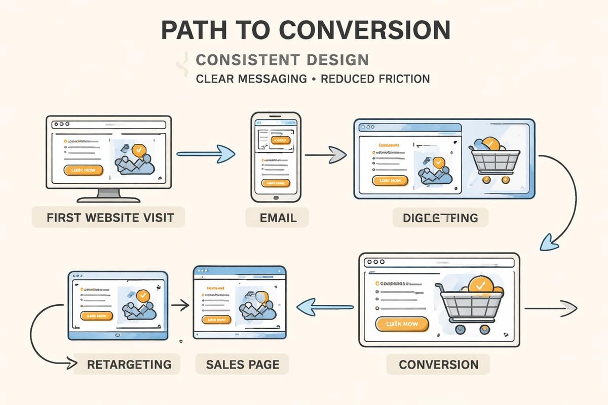
The internet is louder than ever. Your potential clients see hundreds of brands every day, most of them forgettable. Design for digital marketing creates the pattern interrupts and trust signals that separate signal from noise.
Here's what effective design actually does:
- Communicates your positioning before a single word is read
- Reduces cognitive load so visitors make decisions faster
- Creates visual consistency that reinforces brand memory
- Guides users toward conversion actions without friction
- Signals professionalism and reduces perceived risk
The businesses winning in 2026 understand that design isn’t separate from strategy. It's how strategy becomes visible. When someone lands on your site, design tells them within three seconds whether you're the solution they need or just another option to ignore.
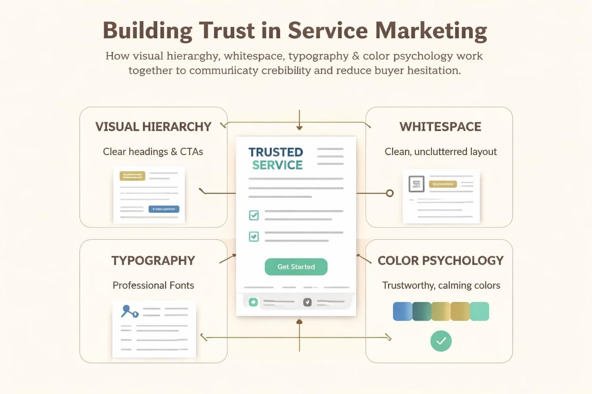
The Trust Equation
Service businesses sell expertise, which means they sell trust. Design for digital marketing either accelerates or destroys that trust before you've had a chance to prove your value.
Research shows users form opinions about website credibility in 50 milliseconds. That's faster than conscious thought. Your design is speaking to the subconscious, telling stories about reliability, attention to detail, and whether you understand their world.
Core Principles That Make Design Work
Effective design for digital marketing follows principles that have nothing to do with trends and everything to do with human behavior.
Visual Hierarchy Directs Attention
Every page has a job. Visual hierarchy makes sure that job gets done. Size, contrast, placement, and whitespace create a reading order that moves people from awareness to action.
| Element | Purpose | Design Application |
|---|---|---|
| Headlines | Capture attention, communicate value | Largest text, high contrast, positioned top-left or center |
| Subheadings | Maintain interest, provide context | Medium weight, break up sections, guide scanning |
| Body Copy | Explain details, overcome objections | Readable size, adequate line height, manageable line length |
| CTAs | Drive conversion actions | High contrast buttons, action-oriented language, strategic placement |
When visual hierarchy is executed properly, visitors move through your content in the exact sequence you need them to. They see the problem, understand the solution, believe you can deliver it, and take action.
Consistency Compounds Recognition
Brand consistency isn't about being boring. It's about being memorable. When your colors, fonts, image styles, and layouts follow consistent rules across every touchpoint, recognition builds faster.
Think of it like compound interest for your marketing. Every consistent interaction deposits a small amount of brand equity. Over time, that compounds into preference and recall.
Consistency checklist for design for digital marketing:
- Typography system with 2-3 fonts maximum
- Color palette with primary, secondary, and accent colors clearly defined
- Image treatment style (photography vs illustration, filters, aspect ratios)
- Spacing and layout grids that repeat across pages
- Button and form styles that look identical everywhere
- Icon set from a single family
The businesses that scale predictably don't reinvent their design with every campaign. They build systems and trust the compound effect.
Mobile-First Isn't Optional Anymore
More than 60% of digital traffic comes from mobile devices. If your design for digital marketing treats mobile as an afterthought, you're losing more than half your potential revenue.
Mobile-first design means starting with the smallest screen and building up. It forces clarity because you can't hide weak messaging behind fancy layouts. Every element has to justify its existence.
When you design mobile-first, desktop becomes easier. The reverse creates bloated mobile experiences that frustrate users and tank conversion rates.
Building Design Systems for Scale
One-off designs don't scale. Systems do. Design for digital marketing that supports growth requires thinking in components, templates, and repeatable patterns.
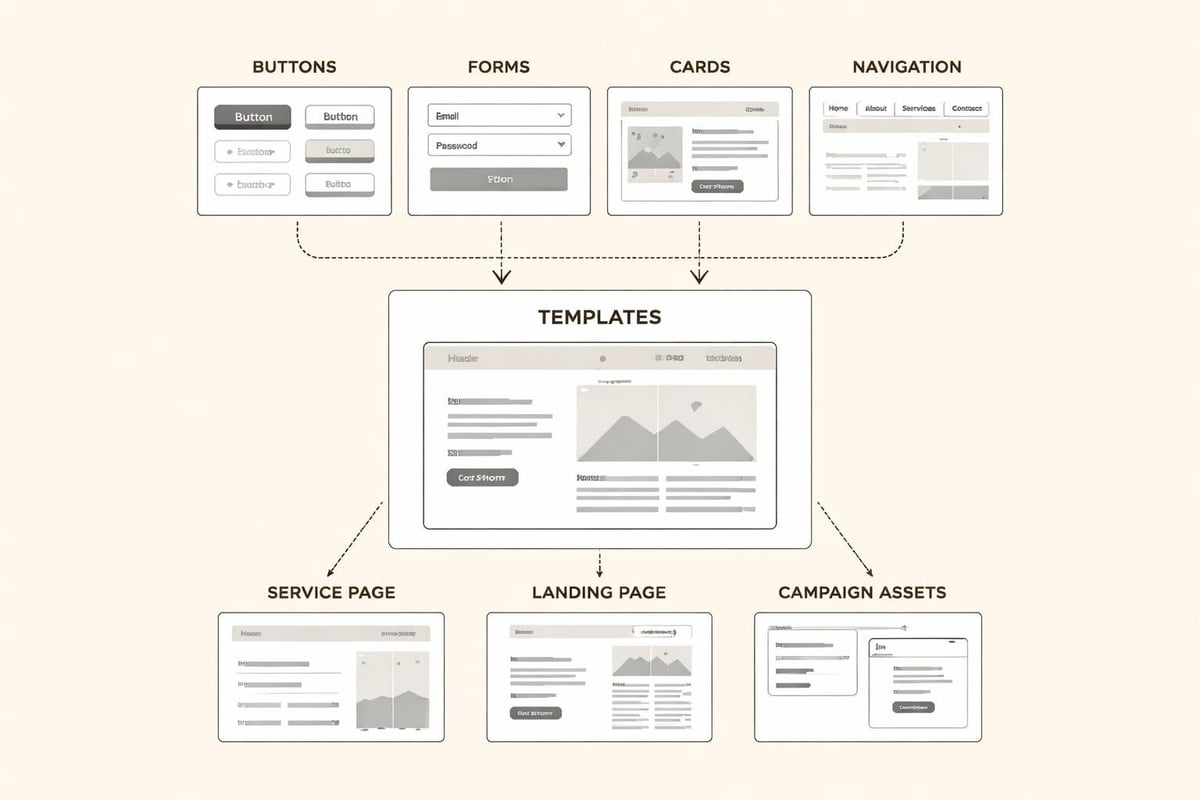
Component Libraries Create Speed
A component library is your collection of reusable design elements. Buttons, form fields, cards, navigation patterns, testimonial blocks. Once built, these components can be assembled into new pages and campaigns in minutes instead of days.
Benefits of component-based design:
- Faster campaign launches – No redesigning from scratch for every initiative
- Consistent user experience – Familiar patterns reduce learning curves
- Easier maintenance – Update one component, fix it everywhere
- Reduced design debt – Less divergence and chaos over time
This is how marketing systems and branding infrastructure creates leverage. The first build takes effort. Everything after that gets exponentially faster.
Templates That Convert
Templates aren't about cutting corners. They're about protecting what works while allowing flexibility where it matters.
Your service pages should follow a proven template: problem statement, solution explanation, proof points, objection handling, call to action. The words change based on the service, but the structure stays consistent because the structure is what converts.
| Template Type | Key Sections | Conversion Focus |
|---|---|---|
| Service Page | Hero, benefits, process, proof, CTA | Move from interest to consultation |
| Case Study | Challenge, approach, results, testimonial | Build credibility through proof |
| Landing Page | Headline, offer, form, social proof | Capture lead information |
| About Page | Story, mission, team, differentiation | Create connection and trust |
Templates let you scale content production without sacrificing conversion performance. They're the assembly line for your marketing.
Design for Different Marketing Channels
Design for digital marketing isn't one-size-fits-all. Each channel has specific requirements and user contexts that demand adapted approaches.
Website Design: Your Conversion Hub
Your website is where everything points. It's where interest becomes contact information and attention becomes pipeline.
Effective website design for service businesses needs clear navigation, scannable content, strategic CTAs, fast load times, and obvious next steps. Every page should answer: "Where am I? What can I do here? Why should I trust you?"
The navigation should be self-explanatory. Services should be easy to find and understand. Contact options should be visible from every page. Social proof should appear before asking for commitment.
Email Design: Clarity Over Creativity
Email design priorities are different. Inbox previews matter more than headers. Mobile rendering is critical. Simple layouts outperform complex ones.
Email design principles:
- Single column layouts for mobile compatibility
- Clear subject lines that set expectations
- Preview text that complements subject lines
- Scannable structure with short paragraphs
- One primary CTA per email
- Alt text for images in case they don't load
According to best practices for graphic design in digital marketing, email design should prioritize function and clarity over visual complexity. Your goal is getting the message read and the link clicked.
Social Media Design: Thumb-Stopping Relevance
Social design needs to interrupt scrolling. That means high contrast, bold text, faces, pattern breaks, and immediate value communication.
But design for digital marketing on social isn't just about attention. It's about alignment. The visual style should match your brand so recognition builds even when people don't click through.
Text overlays need to be readable on mobile. Colors should match your brand palette. Templates should be reusable so you're not starting from zero every post.
Ad Design: Conversion-Focused Simplicity
Paid advertising design has one job: get the click. Everything else is distraction.
Best performing ad creative uses minimal text, clear value propositions, strong visual contrast, faces or product shots, and CTAs that create urgency without being desperate.
Testing is everything. Run variations of headlines, images, layouts, and CTA copy. The design that works rarely matches what you think looks best. Data decides.
User Experience Design Principles
Design for digital marketing that converts understands user experience best practices as the foundation everything else builds on.
Information Architecture
How you organize information determines whether users find what they need or bounce in frustration. Clear categories, logical grouping, intuitive labels, and shallow navigation hierarchies make the difference.
Your site structure should match how customers think about their problems, not how you organize your services internally. If someone needs help with lead generation, they shouldn't have to decode your internal department names to find it.
Navigation That Makes Sense
Navigation should be obvious. Main menu items should use plain language. Dropdowns should be organized by customer goal, not company structure.
Navigation requirements:
- Visible on every page without scrolling
- Uses familiar patterns (logo top left, menu top right)
- Shows current location clearly
- Provides search for complex sites
- Includes clear contact option
When navigation and information architecture align with user mental models, conversion rates improve because friction disappears. People can focus on evaluating your solution instead of figuring out your website.
Load Speed and Performance
Design for digital marketing includes what users don't see: the code, file sizes, and server performance that determine load speed.
Every second of delay reduces conversions. Compress images, minimize code, use lazy loading, leverage browser caching, and optimize for Core Web Vitals. Beautiful design that loads slowly is expensive decoration that costs you revenue.
Measuring Design Effectiveness
Design for digital marketing should be measured like any other business investment. Aesthetic preference doesn't matter. Performance does.
Key Metrics to Track
| Metric | What It Measures | Target Range |
|---|---|---|
| Bounce Rate | Percentage leaving after one page | Under 60% |
| Time on Page | Engagement with content | 2+ minutes for key pages |
| Conversion Rate | Visitors taking desired action | 2-5% for cold traffic |
| Click-Through Rate | Email/ad engagement | 2-5% for emails, 1-3% for ads |
| Form Completion | Lead capture effectiveness | Above 30% |
Track these metrics before and after design changes. Use heatmaps to see where attention goes. Run A/B tests on critical elements like headlines, CTAs, and layouts.
A/B Testing for Continuous Improvement
Design is never finished. It's continuously optimized based on what actual users do, not what we think they'll do.
Test one element at a time: headline variations, button colors, form length, image choices, layout structures. Give tests enough time and traffic to reach statistical significance.
The businesses that dominate their markets iterate and improve design constantly. They treat every page as a hypothesis to be tested rather than a finished product to be admired.
Common Design Mistakes That Kill Conversions
Even well-intentioned design for digital marketing can sabotage results when common mistakes creep in.
Conversion killers to avoid:
- Too many choices – Decision paralysis is real; limit options at each step
- Unclear value propositions – If visitors can't quickly understand what you do, they leave
- Hidden contact information – Make it easy to reach you from every page
- Slow load times – Optimize images and code ruthlessly
- Weak CTAs – Generic "Learn More" buttons underperform specific action language
- Inconsistent branding – Visual chaos creates doubt about professionalism
- Mobile-hostile layouts – Tiny text and impossible tap targets frustrate users
- Auto-playing media – Nothing kills trust faster than unexpected sound
Each mistake seems small. Combined, they create friction that compounds into abandoned sessions and lost revenue.
Building Your Design for Digital Marketing System
Creating effective design for digital marketing requires treating it as infrastructure, not decoration.
Start With Strategy
Design decisions should flow from positioning, not personal preference. Before choosing colors or fonts, define your positioning: who you serve, what transformation you create, why you're different.
Your branding and marketing strategy should inform visual choices. If you serve conservative industries, bold experimental design creates disconnect. If you target innovators, safe corporate design signals you don't understand them.
Document Standards
Create a brand style guide that defines typography, colors, image guidelines, voice and tone, logo usage, and layout principles. This document becomes the reference that keeps everything consistent as you scale.
Style guide essentials:
- Logo files and usage rules
- Color codes (hex, RGB, CMYK)
- Typography hierarchy and font files
- Image treatment examples
- Writing voice and tone guidelines
- Component examples and use cases
A good style guide makes delegation possible. Team members and contractors can create on-brand assets without constant oversight.
Audit and Optimize Regularly
Set quarterly design audits. Review performance metrics, identify pages underperforming benchmarks, test hypotheses for improvement, implement changes, and measure results.
Design for digital marketing isn't a project with an end date. It's an ongoing system that adapts to market feedback, technology changes, and business evolution.
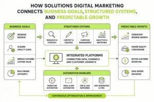
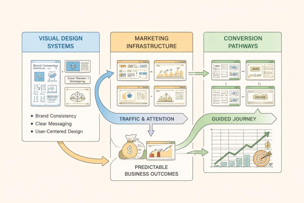
Integration With Marketing Infrastructure
Design doesn't exist in isolation. It integrates with your CRM, automation, content, and analytics systems to create a complete marketing engine.
Your design should support lead capture forms that feed your CRM. Email templates should pull brand elements automatically. Landing pages should track conversions in your analytics. Every piece connects.
When marketing systems work together, design becomes the visible layer of a deeper infrastructure. Leads flow smoothly from awareness to contact to qualification to close because the systems, processes, and visual elements all align.
This is how service businesses scale without chaos. Remove friction, protect every lead, create predictable growth that compounds over time. Design is the structure that makes it visible and trustworthy.
Design for digital marketing creates the trust and clarity that turn attention into revenue. When visual systems align with your positioning, support your conversion goals, and integrate with your marketing infrastructure, growth becomes systematic rather than sporadic. MDO Digital builds these systems for service businesses ready to scale with structure. We design high-trust websites, implement marketing automation, and create brand systems that support predictable demand generation. If you're ready to remove chaos and build marketing that compounds, MDO Digital can help you get there.