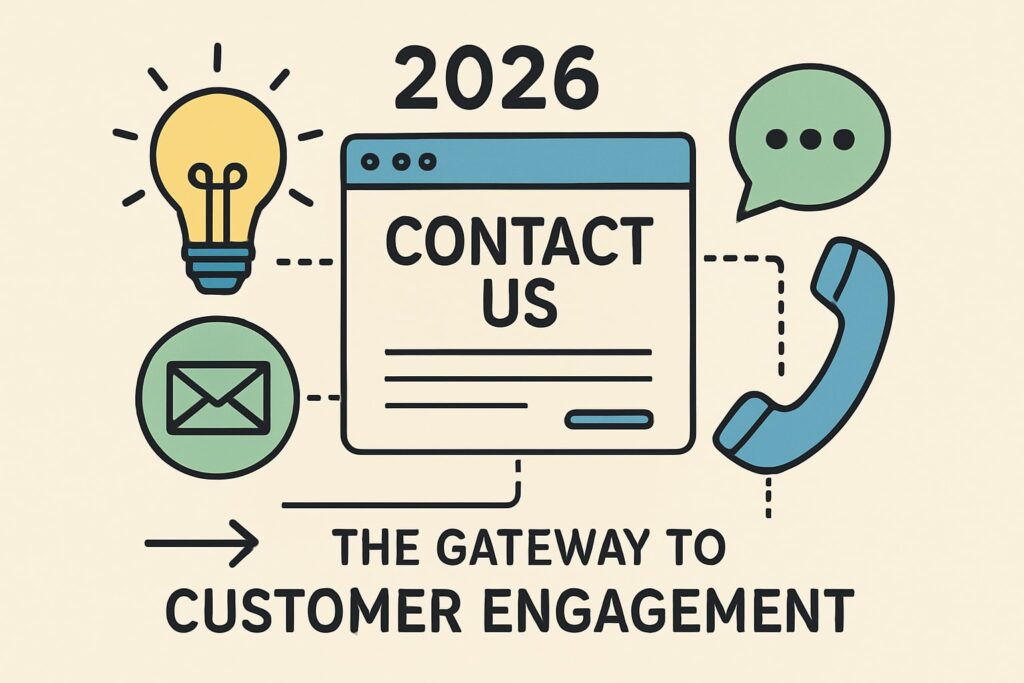
In 2026, a business’s first impression often starts with its contact us website design. This page is now more than a form, it’s the front door to customer relationships and future growth.
This article uncovers seven fresh ideas that will define the next generation of contact us website design. You’ll find practical design strategies, user-focused trends, and technology tips to help you stay ahead in digital communication.
Want more leads and better customer conversations? Explore how these ideas can make your contact us website design a real driver of engagement and business success.
The Evolving Role of Contact Us Pages in 2026
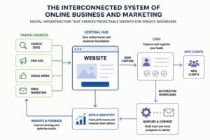
The humble contact us website design has come a long way. In 2026, it is not just a spot for basic details, but a dynamic portal for building trust and driving business growth. Let us look at how expectations and technology are reshaping these pages for the better.
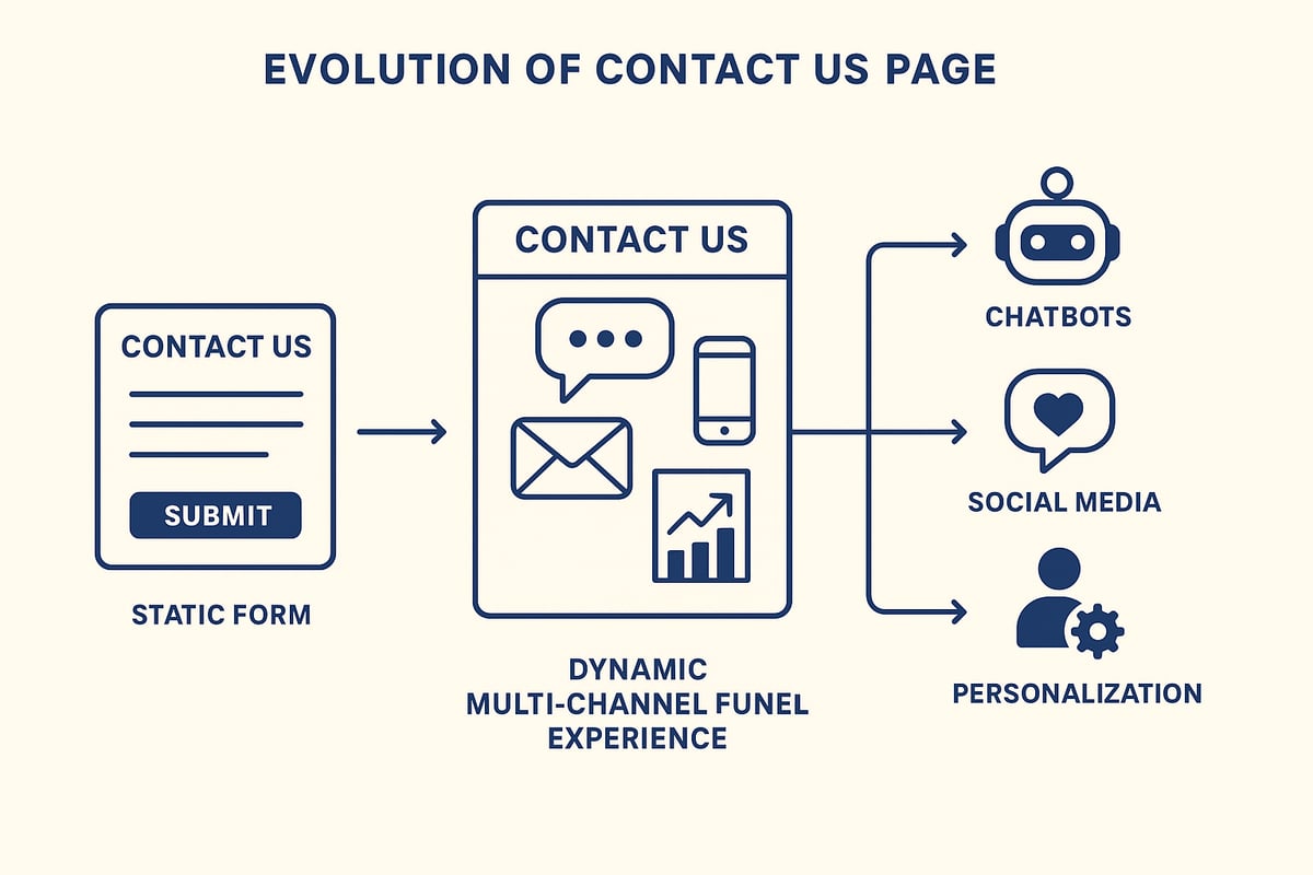
The Shift from Static Forms to Dynamic Experiences
Contact us website design is shifting from simple forms to interactive, branded experiences that genuinely engage visitors. Customers now expect quick responses, multi-channel support, and even embedded chat or video options. Leading brands, like Hootsuite, offer real-time support and multi-path contact funnels, showing how contact us website design can provide seamless, immediate help. If you want to see this evolution in action, check out these Contact Us Page Design: Examples & Best Practices that highlight the move toward interactive and user-friendly layouts. The days of a lonely form are over; dynamic experiences are the new standard.
Personalization and User Journey Mapping
Modern contact us website design now leverages AI to personalize the user journey. Instead of a one-size-fits-all form, pages adapt to each visitor’s needs, intent, and behavior. AI tools anticipate what a customer might want, routing inquiries to the right team or even serving up instant answers. Studies show that users are far more likely to engage with contact us website design that feels tailored to them. For example, some brands report up to 30% higher engagement when forms change based on user actions. This approach not only streamlines communication but also increases satisfaction.
Integration with Business Systems and Automation
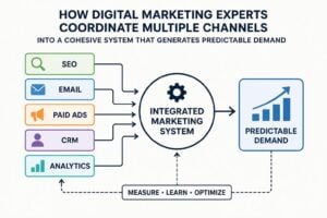
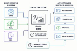
Contact us website design in 2026 is all about connection. Pages are seamlessly linked with CRMs, automation tools, and analytics platforms. This integration means inquiries are tracked, qualified, and followed up faster than ever. Automation can send instant replies, update customer records, and even trigger dynamic FAQs based on the question. For businesses, this results in better lead management and more accurate tracking. Companies using automated follow-ups see improved response times and happier prospects. Integration brings efficiency to every aspect of contact us website design.
Accessibility and Inclusivity in Contact Design
It is crucial that contact us website design works for everyone. Accessibility is not just a checkbox, but a core part of user experience. Modern designs include ADA compliance, language options, voice input, and larger clickable areas. Some brands even offer instant chat, social support, or appointment booking to cater to different needs. Inclusive contact us website design means nobody is left out, regardless of ability or preference. By prioritising accessibility, businesses not only comply with regulations but also show they value every customer.
7 Fresh Ideas for Contact Us Website Design in 2026
The pace of change in contact us website design is relentless. What worked yesterday is quickly replaced by smarter, more user-friendly ideas. If you want your business to stand out, you need to stay a step ahead. Let’s explore seven cutting-edge strategies that will shape how customers connect with brands in 2026.
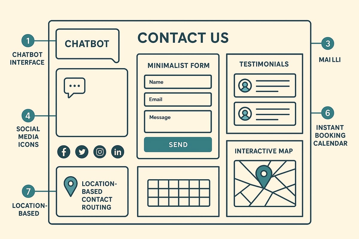
1. Conversational AI & Smart Chatbots
Conversational AI is now the frontline of contact us website design. Instead of static forms, users are greeted by brand-aligned chatbots ready to help at any hour. These bots answer common questions, qualify leads, and escalate complex requests to real people. The result is a contact us website design that feels alive and responsive, no matter when visitors reach out.
For example, YETI’s chatbot uses playful banter and branded language to create a memorable first impression. It pulls in knowledge base info and connects directly with the company’s CRM, making transitions seamless for both users and support teams.
By 2026, chatbots are predicted to handle 75% of all customer service interactions. This shift shrinks response times and boosts satisfaction, freeing staff for high-value tasks. When designing your contact us website design, focus on natural conversation flows, clear privacy notices, and easy escalation paths. Make sure users know when they’re chatting with AI, and give them the option to reach a human if needed.
Key Tips:
- Train your bot to recognise intent and escalate gracefully.
- Use brand voice, not generic replies.
- Always display privacy and data use info.
- Integrate with CRM and support tools for context-rich responses.
Smart chatbots are no longer a novelty—they’re the new normal for contact us website design.
2. Multi-Channel Contact Options & Social Integration
Today’s customers expect to connect on their terms. The best contact us website design offers a full suite of channels: email, phone, live chat, WhatsApp, and direct messaging on social platforms. Embedding these options directly in your contact us website design means users can pick what suits them best, without hunting for links.
Hootsuite sets the bar here, blending social support, direct messaging, and even location maps for in-person queries. This approach boosts engagement and ensures nobody slips through the cracks. Data shows Gen Z and Millennials prefer messaging apps and social DMs over traditional forms, so catering to these habits is critical.
How do you keep it seamless? Design your contact us website design with a unified look and feel across all channels. Use icons and clear labels so users know what to expect. Enable smooth channel switching—if a chat goes unanswered, offer email or callback options without making the user repeat themselves.
Channel Comparison Table:
| Channel | User Preference | Best Use Case |
|---|---|---|
| High (30+) | Formal, detailed queries | |
| Live Chat | High (all ages) | Quick questions, support |
| WhatsApp/DM | Rising (18–35) | Instant, informal contact |
| Phone | Moderate | Complex or urgent issues |
As user preferences keep shifting, your contact us website design must be ready to evolve with them.
3. Minimalist & Distraction-Free Forms
Less is more in modern contact us website design. Long, cluttered forms are conversion killers. The new standard is ultra-simple, focused forms that ask only what’s essential. Progressive disclosure lets you collect more info when needed, without overwhelming users upfront.
Take Littlelines as an example—their contact us website design uses just five fields, paired with reassuring microcopy. This simplicity builds trust and boosts completion rates. In fact, forms with fewer than five fields can convert up to 120% better than longer ones.
To optimise your contact us website design for conversions, start by removing any non-essential fields. Use conditional logic to reveal extra questions only when relevant. Always test your form on mobile devices, ensuring large tap targets and clear labels for accessibility.
Best practices:
- Limit initial fields to three to five.
- Use one-column layouts for readability.
- Add subtle cues (like progress bars) for longer forms.
- Provide instant feedback for errors or success.
Remember, a minimalist approach in contact us website design is not about stripping away personality—just friction.
4. Embedded Testimonials and Social Proof
Trust is the secret sauce in contact us website design. By embedding rotating testimonials, case studies, or partner logos right on the page, you give hesitant visitors that last nudge to reach out. This is more than fluff—pages with social proof see up to 34% higher engagement.
Kev Adamson’s contact us website design is a lesson in credibility, featuring a carousel of real client testimonials just above the form. This placement means social proof is seen at the decision point, not buried below the fold.
What should you include? Customer quotes, star ratings, industry awards, and logos of well-known partners. Make sure all testimonials are specific and authentic, not generic praise. You can also add trust badges, like SSL certificates or privacy policy links, to reinforce safety.
Placement Strategies:
- Above the form for maximum visibility.
- In a sidebar for persistent reassurance.
- As a subtle background overlay for visual interest.
Authentic social proof can turn a hesitant visitor into a confident lead, making it a must for any contact us website design.
5. Interactive Visual Elements & Brand Storytelling
A memorable contact us website design uses visuals to guide, engage, and delight. Playful animations, branded illustrations, and interactive maps can all transform a basic form into a brand experience. Buzzworthy Studio, for instance, uses a bold colour-contrasted call-to-action and an interactive location map to direct user attention.
Visual content increases message retention by 65%. This means that your contact us website design isn’t just functional—it’s sticky. Use animations to highlight CTAs, or illustrations that reinforce your brand story. But remember, don’t sacrifice usability for flair. Keep page speed fast and ensure all visuals are accessible (with alt text and high-contrast colours).
Tips for Success:
- Guide the user’s eye to key actions.
- Balance creativity with clarity.
- Test visuals on mobile and assistive devices.
For inspiration, you can browse Contact Us page design examples to see how top brands use visual storytelling to make their contact us website design stand out.
6. Instant Booking & Appointment Scheduling Features
Why make users wait for a reply when they can book a meeting instantly? Modern contact us website design often includes embedded scheduling tools, letting customers grab a time slot with your team in seconds. This is a game-changer for service-based businesses, sales consultations, or support calls.
Whole. offers a CEO booking feature right on their contact page, making it easy for prospects to connect without back-and-forth emails. Pages with instant booking see a 22% increase in lead-to-client conversions, showing just how powerful this feature can be.
To implement this in your contact us website design, integrate with calendar and video conferencing tools. Let users pick dates, times, and even meeting formats (phone, video, in-person). Always display privacy info and use secure booking platforms to protect user data.
Key Advantages:
- Reduces friction and waiting times.
- Empowers users to take action.
- Streamlines your pipeline for faster sales.
Instant booking is quickly becoming a baseline expectation in contact us website design, so don’t get left behind.
7. Location Awareness & Personalised Contact Routing
Personalisation is the future of contact us website design. By using location data, you can instantly show users the most relevant office, local contact, or language-specific support. Dynamic routing ensures each inquiry lands with the right team, speeding up response times and improving satisfaction.
Hootsuite’s contact us website design is a great example, using interactive maps and segmented contact options based on the user’s region. With 60% of users preferring local contact choices, this approach is both practical and user-centric.
To add this to your contact us website design, use geolocation APIs or ask users to select their location. Make sure you comply with privacy laws like GDPR, and always offer a manual fallback for users who block location sharing.
Personalisation Strategies:
- Show local phone numbers and addresses.
- Route forms to regional teams.
- Offer content in the user’s language.
A tailored contact us website design makes every visitor feel seen and valued, setting the stage for lasting relationships.
UX Best Practices for High-Converting Contact Us Pages
A high-converting contact us website design is more than just a pretty face. It is about making every interaction effortless, secure, and reassuring for users. Let us break down the key elements that set winning contact pages apart in 2026.
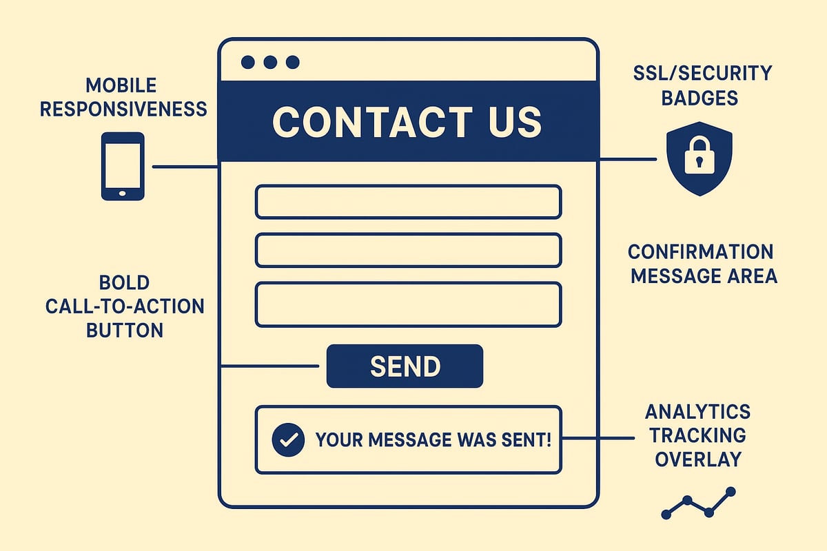
Mobile Optimization & Responsive Design
Today, users expect a contact us website design to work flawlessly on any device. Mobile-optimised pages are the norm, not the exception. Responsive layouts ensure forms and calls-to-action remain accessible on every screen size.
Touch-friendly fields, large buttons, and fast loading are essential. According to Contact Us Page Design Best Practices for Small Businesses, mobile-first design increases form completion rates and reduces drop-offs. Always test on real devices to spot usability issues early.
Key tips:
- Use single-column layouts for mobile.
- Keep input fields wide and easy to tap.
- Prioritise speed by compressing images and scripts.
Security, Privacy, and Trust Signals
Trust is the foundation of any contact us website design. Visitors need to know their data is safe. Display your SSL certificate, privacy policy, and anti-spam measures clearly.
A quick table to highlight essential trust signals:
| Trust Signal | Placement | Purpose |
|---|---|---|
| SSL badge | Near form fields | Shows secure data handling |
| Privacy policy link | Below submit button | Explains data use |
| CAPTCHA | Before submit | Prevents spam entries |
Make privacy statements brief and easy to understand. For compliance, ensure your page meets GDPR and local data laws. Clear trust signals reduce friction and increase form submissions.
Clear Calls-to-Action and Confirmation Feedback
A standout call-to-action is the anchor of effective contact us website design. Use bold colours, clear language, and prominent placement. Guide users with action words like “Send Message” or “Book a Call.”
After submission, users crave reassurance. Instant confirmation messages, next steps, and expected response times keep the experience positive. Consider showing a thank-you screen with contact details or a follow-up promise.
Small tweaks, like animated checkmarks or progress bars, can increase user confidence and reduce uncertainty.
Continuous Testing and Analytics
Optimising your contact us website design is never a set-and-forget job. Use A/B testing to compare form layouts, CTA wording, or button colours. Heatmaps reveal where users drop off or hesitate.
Track conversion rates, submission errors, and time on page to spot improvement areas. According to Web Design Statistics 2026: Boost Conversions, UX improvements can lift conversion rates significantly. Regularly review analytics and tweak your design for ongoing gains.
By making data-driven adjustments, you ensure your contact page keeps delivering value as user expectations evolve.
Future Trends in Contact Us Website Design
The next era of contact us website design is shaping up to be smarter, more personal, and surprisingly human. As digital interactions become the norm, businesses have a unique opportunity to turn these touchpoints into genuine conversations. Let’s take a look at the big trends that will define how customers reach out, connect, and feel heard in the years ahead.
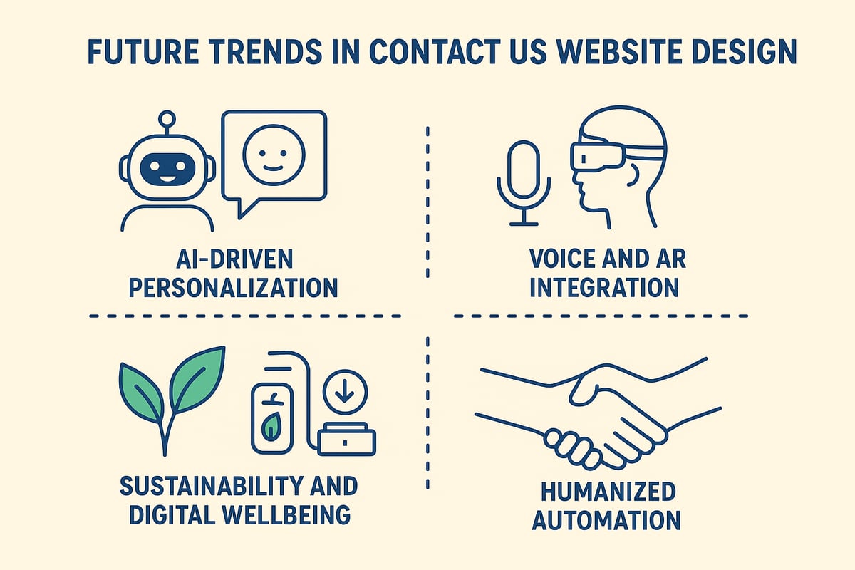
AI-Driven Personalisation and Predictive Routing
AI is rapidly transforming contact us website design by making every interaction feel tailored. Smart algorithms now analyse user data, browsing history, and even intent to predict the best way to help. This means visitors are shown the most relevant contact options, forms adapt in real time, and questions can be answered before they’re even asked.
For example, predictive routing can connect a high-value lead straight to a sales rep, while a returning customer gets instant access to their past support tickets. This level of personalisation not only improves efficiency but also creates a sense of being truly understood.
As more brands adopt these tools, expect AI-driven contact us website design to become the new standard for delivering fast, frictionless help.
Integration with Voice and Augmented Reality (AR)
The way users interact with contact us website design is evolving beyond clicks and taps. Voice-based features are making it easier for everyone to reach out, whether by speaking into a microphone or using a virtual assistant. Imagine a user asking for help and having a form fill itself out, hands-free.
On the AR front, businesses can offer visual, step-by-step assistance. For instance, a customer could use their phone’s camera to get AR-guided support for a product issue. This trend makes contact us website design more accessible and interactive, bridging the gap between digital and real-world help.
With these technologies, the focus shifts to making support intuitive, fast, and available in any context.
Sustainability and Digital Wellbeing
Sustainability is quietly becoming a core principle in contact us website design. Sites are now being built to load quickly, use minimal data, and reduce energy consumption. This not only benefits the environment but also improves accessibility for users with slower connections or limited data.
Digital wellbeing is another rising priority. Clean layouts, gentle colour schemes, and concise messaging help avoid overwhelming users. Simple, direct options for contact reduce cognitive load and respect visitors’ time.
By centering sustainability and wellbeing, brands demonstrate care for both their audience and the planet, creating trust that lasts beyond the first message.
The Role of Automation in Humanising Digital Contact
Automation is often seen as cold, but in contact us website design, it can actually foster more human connections. The latest tools handle routine queries, triage requests, and offer instant responses, freeing up real people to focus on complex or emotional needs.
Hybrid models are gaining ground, where AI helps users get started, then hands off to a human when the situation calls for empathy or expertise. This approach balances efficiency with genuine care, keeping customer satisfaction front and centre.
For those looking to implement these innovations, exploring website design services overview is a practical first step. As automation evolves, the heart of contact us website design will remain the same: making every interaction meaningful.
If you’re thinking it’s time your Contact Us page did more heavy lifting—maybe even pulled its own weight for once—let’s chat. We’ve just covered a stack of ideas that can turn a simple form into a genuine growth tool, and honestly, most businesses don’t even scratch the surface. Whether you want to cut the chaos, protect your leads, or just make your brand feel a bit more, well, human, it starts with a clear plan for what comes next. If you’d like a sounding board or a second pair of eyes, you can Book a Strategy Call and we’ll map out your next steps together.