Your website has about three seconds to make an impression. That's it. Three seconds before someone decides whether to stay or bounce back to Google. This is where graphic design in digital marketing stops being a nice-to-have and becomes infrastructure. Not decoration. Not an afterthought. It's the visual system that either builds trust immediately or destroys it before anyone reads a single word. For service based businesses trying to scale with clarity, design isn't about making things pretty. It's about removing friction, guiding decisions, and turning attention into predictable demand.
Why Visual Systems Matter More Than Individual Designs
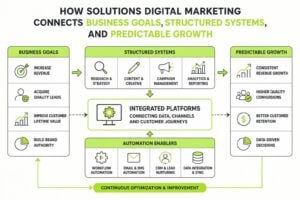
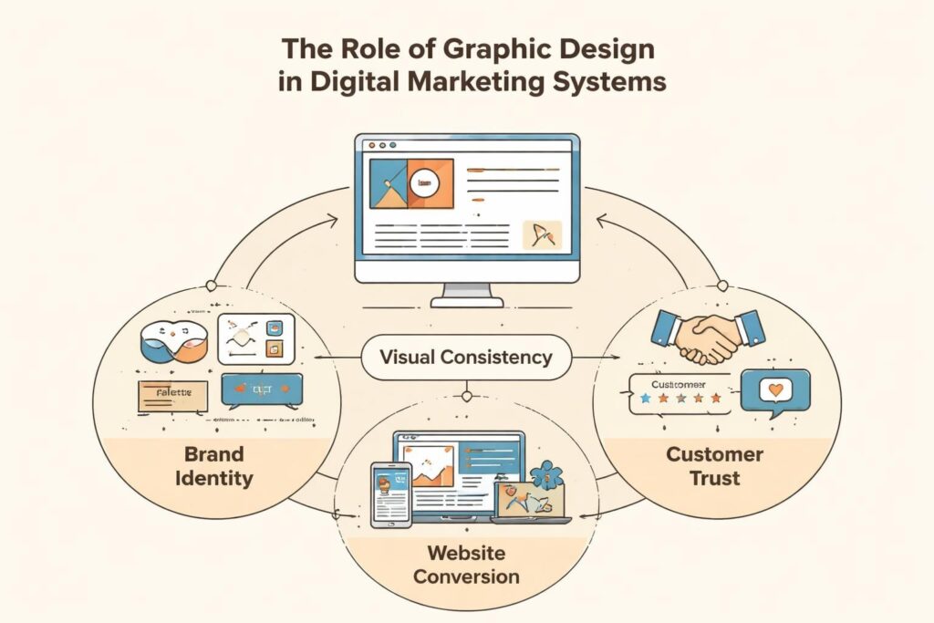
Most businesses think about graphic design in digital marketing as a series of isolated tasks. Logo here, social post there, maybe a brochure if we're feeling fancy. That's backwards. The real power comes from treating design as a system, not a collection of assets.
A visual system creates recognition before comprehension. When someone lands on your website, sees your LinkedIn post, opens your email, they're not consciously analyzing your brand. They're pattern matching. Does this feel consistent? Does it look professional? Can I trust this? Strong graphic design influences brand identity by answering these questions before the rational brain even engages.
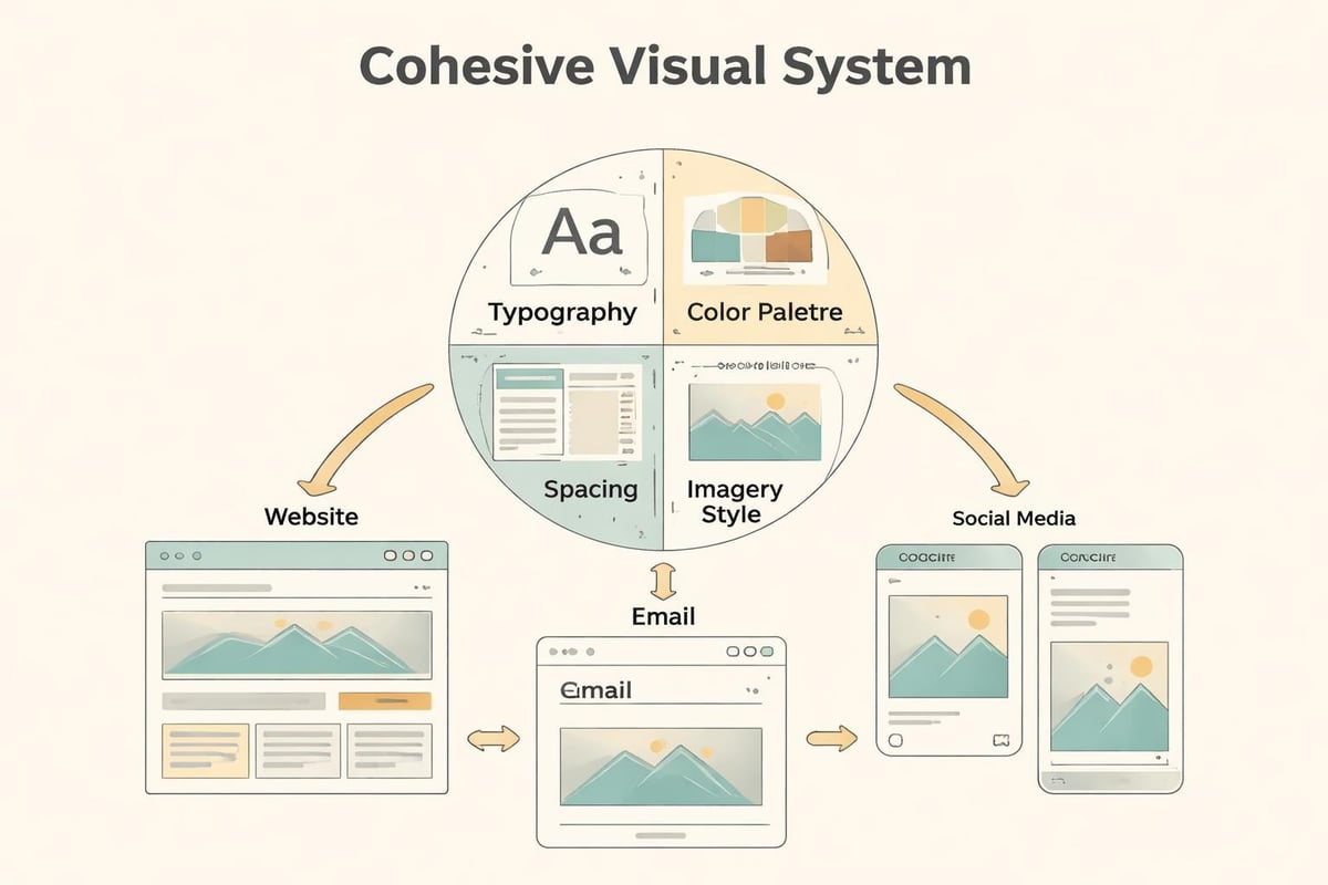
Here's what a proper visual system includes:
- Typography hierarchy that guides reading and emphasizes conversion points
- Color palette that creates emotional response and brand recognition
- Spacing and layout principles that reduce cognitive load
- Iconography and imagery style that reinforces your positioning
- Grid systems that create consistency across all touchpoints
When you nail this, everything compounds. Your ad spend works harder because people recognize you. Your website converts better because trust is pre-built. Your sales process shortens because design has already done half the credibility work.
The Conversion Architecture Hidden in Good Design
Let's talk about what actually happens when someone interacts with your digital marketing materials. They're not reading every word. They're scanning. Looking for signals. Making snap judgments about whether this is worth their time.
Graphic design in digital marketing creates a hierarchy of attention. It tells people where to look first, what matters most, and what action to take next. Without this structure, even great copy gets ignored.
Visual Hierarchy Drives Action
Your eye naturally moves through designed content in a predictable way. F-pattern for text-heavy pages. Z-pattern for landing pages. Good designers use this to create a path from first impression to conversion point.
| Design Element | Purpose | Conversion Impact |
|---|---|---|
| Headlines | Capture attention, communicate value | 80% of visitors read only headlines |
| White space | Reduce overwhelm, focus attention | Increases comprehension by 20% |
| Contrast | Highlight CTAs, separate sections | Can improve conversion rates by 30%+ |
| Imagery | Build emotional connection, show results | Increases engagement and memory retention |
The businesses that scale aren't just throwing up websites and hoping. They're using design principles that enhance user experience and guide visitors toward specific outcomes. Every element earns its place or gets cut.
Brand Recognition Is a Compounding Asset
Here's something most people miss about graphic design in digital marketing: consistency is worth more than creativity. Not because creativity doesn't matter, but because recognition compounds over time.
Think about the last ad that stopped your scroll. Chances are you'd seen that brand before. Maybe not consciously, but somewhere in your pattern-matching brain, there was familiarity. That's not accident. That's systematic visual consistency doing its job.
Building recognition requires:
- Define core visual elements (logo, colors, fonts, image style)
- Create templates for recurring content (social posts, email headers, proposal covers)
- Document standards so anyone on your team maintains consistency
- Audit touchpoints quarterly to catch drift before it damages recognition
- Iterate systematically rather than redesigning from scratch
When you see a brand that feels "established," you're seeing the result of this discipline. They haven't changed their core visual identity every six months chasing trends. They've built a system and protected it.
Our approach to branding focuses on this kind of strategic consistency. Because chaos doesn't scale. Systems do.
Social Media: Where Design Speed Meets Strategic Thinking
Social platforms have turned every business into a publisher. That's created both opportunity and overwhelm. The businesses winning on social aren't posting more. They're posting smarter, with design systems that let them move fast without sacrificing quality.
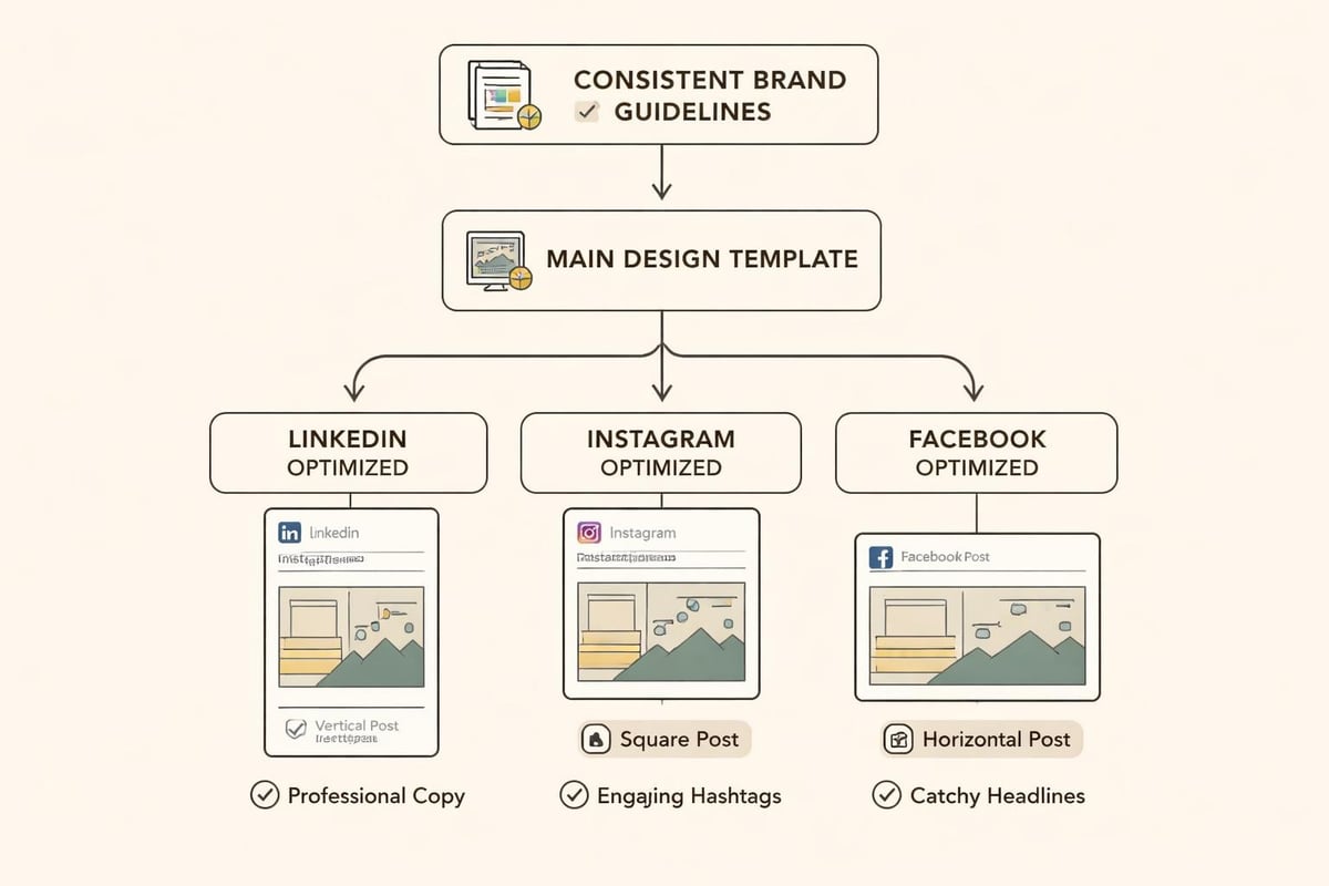
Graphic design in digital marketing for social media isn't about creating masterpieces. It's about creating recognizable, scroll-stopping content at velocity. That requires templates, brand guidelines, and a clear understanding of platform-specific best practices.
Platform-Specific Design Considerations
Each platform has its own visual language. LinkedIn rewards professional, data-driven content. Instagram demands high-quality imagery and cohesive grid aesthetics. Facebook still works for longer-form visual stories. Ignoring these nuances kills engagement.
- LinkedIn: Clean, professional layouts with data visualizations and clear headlines
- Instagram: Consistent color grading, strong brand presence in Stories and Reels
- Facebook: Attention-grabbing first frames for video, readable text overlays
- Twitter/X: Simple, high-contrast graphics that work at small sizes
The mistake most businesses make is treating social as an afterthought. They spend thousands on their website, then slap together social graphics in Canva five minutes before posting. That inconsistency destroys trust faster than bad design alone ever could.
Email Design That Actually Gets Read
Your email list is probably your most valuable marketing asset. It's also where most businesses waste potential through neglect of basic design principles. People don't read emails, they scan them. If your design doesn't accommodate that behavior, your message dies unread.
Effective visual communication in email marketing means understanding the constraints. Mobile screens. Dark mode. Image blocking. Accessibility requirements. These aren't obstacles. They're design parameters that force clarity.
Email design essentials:
- Single column layouts that work on any screen size
- Hierarchy that makes scanning effortless (headline, subhead, CTA)
- Buttons instead of text links for primary actions
- Alt text for images (because many people browse with images off)
- Sufficient contrast for dark mode compatibility
The best email designs are almost invisible. You don't notice the design. You notice the message, understand the value, and take action. That's the goal.
Website Design: Your 24/7 Sales Infrastructure
Your website isn't a brochure. It's infrastructure. It's working while you sleep, answering questions, building trust, generating leads. Or it should be. Most service based businesses have websites that look professional but convert poorly because the graphic design in digital marketing hasn't been optimized for behavior.
People don't browse websites linearly anymore. They bounce around. They check your work page before your homepage. They read your about page to see if you're credible. Strong website design anticipates this chaos and creates clear paths regardless of entry point.
Conversion-Focused Design Elements
| Element | Purpose | Best Practice |
|---|---|---|
| Hero section | Communicate value instantly | Clear headline, supporting subhead, visible CTA |
| Navigation | Enable discovery without overwhelm | 5-7 main items maximum, clear hierarchy |
| Trust indicators | Build credibility fast | Client logos, testimonials, case study previews |
| Contact CTAs | Reduce friction to conversation | Visible on every page, multiple formats (form, calendar, email) |
Every design decision should answer one question: does this help someone take the next step, or does it create friction? Fancy animations that slow load time? Friction. Auto-playing video that startles visitors? Friction. Nine different CTAs competing for attention? Friction.
The businesses that scale remove friction systematically. They test, measure, and optimize based on how real humans actually behave.
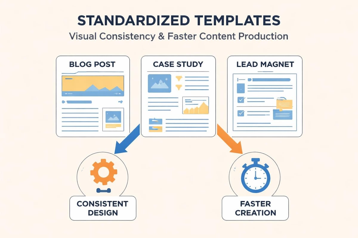
Content Marketing Needs Design Systems
You can't content market your way to growth without design support. Even brilliant writing gets ignored if it's presented poorly. Blog posts with walls of text. PDFs that look like they're from 2003. Whitepapers formatted like academic journals. All wasted opportunity.
Graphic design in digital marketing for content means creating templates and systems that make your insights consumable. People scroll past hundreds of content pieces daily. Yours needs to communicate value at a glance.
Content design system components:
- Blog post templates with consistent formatting, pull quotes, and imagery
- Lead magnet designs that look valuable enough to trade an email for
- Case study layouts that guide readers through problem, solution, results
- Data visualization standards for presenting insights clearly
- Quote and testimonial formats that build social proof
When you systematize this, content production speeds up. Quality stays consistent. And you build that compounding recognition effect across everything you publish.
Paid Advertising: Where Design ROI Is Measurable
Paid ads are the most honest test of graphic design in digital marketing effectiveness. You can measure exactly how design impacts results. Click-through rates. Conversion rates. Cost per acquisition. The numbers don't lie.
Visual elements in advertising directly impact performance. A well-designed ad with mediocre copy often outperforms great copy with weak visuals. Because people scan visual information 60,000 times faster than text. Your design has to communicate value before anyone reads a word.
Ad Creative Best Practices by Platform
Different platforms reward different design approaches. Google Display ads need immediate clarity. Facebook ads benefit from native-looking content. LinkedIn responds to professional, data-driven creative.
- Facebook/Instagram: User-generated style, minimal text, strong first frame for video
- Google Display: Clear value prop, brand presence, single focused CTA
- LinkedIn: Professional imagery, headline-focused, credibility indicators
- YouTube: Attention-grabbing thumbnails, consistent branding, clear value communication
The businesses getting positive ROI from paid ads aren't outspending competitors. They're out-testing them. Running multiple creative variations. Measuring what works. Doubling down on winners.
Design Operations: How Systems Beat Talent Alone
Here's an uncomfortable truth: having a talented designer doesn't guarantee good outcomes. You also need systems. Because even great designers produce inconsistent work without clear processes, documented standards, and feedback loops.
Design operations means treating design like any other business function. With workflows, quality checks, and measurable outcomes. Not creative chaos hoping inspiration strikes.
Essential design ops components:
- Brand guidelines that document every visual decision
- Asset libraries so teams use approved, current materials
- Approval workflows that prevent bottlenecks without sacrificing quality
- Template systems that speed production while maintaining standards
- Regular audits to catch inconsistency before it damages brand equity
When you build this infrastructure, graphic design in digital marketing becomes predictable. You know how long things take. You maintain quality at scale. You can delegate without losing control.
Accessibility: Good Design Includes Everyone
Accessible design isn't optional anymore. It's both ethical requirement and business opportunity. Twenty-six percent of American adults have some form of disability. That's a quarter of your potential audience you're excluding with inaccessible design.
Basic accessibility isn't complicated. Sufficient color contrast. Alt text for images. Readable font sizes. Keyboard navigation. Clear heading hierarchy. These improvements help everyone, not just people with disabilities.
| Accessibility Principle | Impact | Implementation |
|---|---|---|
| Color contrast | Ensures text readability | Minimum 4.5:1 ratio for body text |
| Alt text | Enables screen reader access | Descriptive text for all meaningful images |
| Font size | Improves readability across ages | 16px minimum for body text |
| Heading hierarchy | Creates navigable structure | Proper H1-H6 usage, no skipping levels |
Sites with better accessibility also rank better. Google rewards user experience signals. Accessible sites load faster, have clearer structure, and keep visitors engaged longer. All ranking factors.
Measuring Design Impact on Business Outcomes
You can't improve what you don't measure. Graphic design in digital marketing needs to connect to actual business metrics, not subjective opinions about what looks good.
Track these metrics to understand design impact:
- Conversion rate by landing page design variation
- Time on page as indicator of engagement
- Bounce rate showing whether design creates trust
- Click-through rate on CTAs with different visual treatments
- Form completion rate revealing friction points in user experience
The businesses that scale use data to guide design decisions. They A/B test. They use heatmaps to see where people actually look. They watch session recordings to find confusion points. Then they design solutions to specific, measured problems.
This isn't design by committee. It's design informed by reality. What actual humans actually do when they interact with your marketing.
Integration: Where Design Meets Marketing Systems
Here's where most businesses fail. They create beautiful designs that don't connect to their marketing infrastructure. The website looks great but doesn't integrate with their CRM. The lead magnet is gorgeous but the download process is broken. The email design is perfect but it triggers spam filters.
Graphic design in digital marketing can't exist in isolation. It needs to work within your broader marketing systems architecture. That means designers need to understand technical constraints, workflow requirements, and data needs.
Critical integration points:
- CRM and email platforms (design templates that work technically, not just visually)
- Analytics and tracking (designs that don't break measurement pixels)
- Advertising platforms (creative specs and technical requirements)
- Content management systems (designs that editors can actually implement)
- Marketing automation (visual assets that trigger properly across workflows)
When design and systems work together, everything compounds. Your beautiful website actually captures leads. Your stunning emails actually get delivered. Your brilliant ads actually track conversions properly.
The Real Cost of Bad Design
Let's talk about what poor graphic design in digital marketing actually costs. Not in design fees. In missed opportunity.
Bad design kills trust instantly. Someone lands on your site, sees outdated visuals or inconsistent branding, and bounces. You paid for that click. Your targeting was right. Your offer was relevant. But design killed the conversion before content had a chance.
Hidden costs of poor design:
- Higher cost per acquisition because ads and landing pages don't convert
- Longer sales cycles because credibility has to be rebuilt in every conversation
- Lower lifetime value because inconsistent brand experience reduces loyalty
- Wasted content because poor presentation kills distribution and engagement
- Team frustration because everyone has different opinions but no standards
The businesses that treat design as infrastructure rather than decoration remove these costs. They convert more traffic. They close faster. They retain longer. The math is simple once you measure it.
Graphic design in digital marketing isn't about aesthetics. It's about removing chaos, building trust fast, and creating systems that turn attention into predictable demand. Every visual decision either compounds your authority or fragments it. If you're ready to build marketing infrastructure that actually scales, MDO Digital helps service based businesses create the clarity, consistency, and conversion systems that turn marketing from expense into growth engine.